It’s time to dive into the world of PPC landing pages—the digital maestros that turn clicks into conversions. These dedicated pages, fueled by pay-per-click ads on platforms like Google Ads, focus sharply on a single goal, known as the call to action (CTA). Their magic lies in minimizing distractions, providing a direct route from curiosity to conversion.
Want to elevate your PPC game and witness the metamorphosis of clicks into conversions? Keep reading on. 🚀
What is a PPC landing page?
A PPC landing page is a standalone web page you intend to use in a paid campaign on Google Ads, Bing Ads, or similar. It’s a dedicated page where visitors “land” after clicking through on a pay-per-click ad.
A PPC (pay-per-click) landing page has a singular purpose: to convert visitors who have clicked on a paid advertisement. In digital marketing, PPC campaigns involve advertisers paying a fee each time their ad is clicked. These campaigns can be highly effective in driving targeted traffic to a website, but the real magic happens when visitors arrive at your PPC landing page.
What are the benefits of PPC landing pages?
- Laser-focused content: The content on a PPC landing page is tailored to match the messaging of your corresponding PPC ad. This alignment is key in maintaining your visitor’s interest and ensuring continuity from the initial click.
- Clear CTA: A PPC landing page is not the place for ambiguity. It features a prominent and compelling call to action that directs visitors toward the desired conversion. Whether it’s a “Buy Now” button, a sign-up form, or a download link, the CTA is the star of the show.
- Minimal distractions: Unlike a homepage or general website page, a PPC landing page minimizes distractions. Extraneous links, navigation options, or unrelated information are stripped away, keeping your visitor’s attention focused solely on the conversion goal.
- Relevant design: The visual elements of a PPC landing page are carefully chosen to complement the ad’s visuals and messaging. Consistent branding and imagery create a cohesive experience, reinforcing the connection between the ad and the landing page.
- Responsive and fast: In the fast-paced world of online browsing, a PPC landing page is responsive and loads quickly. A seamless user experience contributes to higher conversion rates, ensuring that visitors don’t lose interest while waiting for the page to load.
- Customizable and test-friendly: One of the strengths of PPC landing pages lies in their adaptability. Marketers can create multiple versions of a PPC landing page and run A/B tests to determine which elements are most effective in driving conversions. From headline variations to different CTAs, these tests help refine the landing page for optimal performance.
Jennifer Pepper
Jennifer Pepper is the former Director of Content Marketing at Unbounce. One day she wants to direct the ads you skip on YouTube. Follow her on Twitter @PeppersWrite.
» More blog posts by
Jennifer Pepper
Banafshe Salehi
Banafshe is a writer and creator who loves long walks on the beach (kidding?). When she’s not selling you on her puns or her pop-culture analogies, she can be found at the busiest intersection in her city with her headphones. Which are totally not falling apart.
» More blog posts by
Banafshe Salehi
What is the difference between a PPC landing page and a webpage?
The key distinction between a standard webpage and a PPC landing page lies in its razor-sharp focus. While a website’s homepage or internal pages may have multiple objectives, a PPC landing page is crafted for a specific conversion goal, be it a purchase, sign-up, or download. It acts as the dedicated destination for individuals who clicked on a carefully crafted ad, ensuring a seamless transition from curiosity to conversion.
What is the difference between a PPC landing page and any other landing page?
A standard landing page is a standalone web page, designed with a specific goal or call to action. PPC landing pages also have all of these qualities, but they go a step further and aim to tailor a visitor’s experience—reinforcing the promises of their respective PPC ads seamlessly. Beyond enhancing user experience, PPC landing pages earn favor with Google Ads, yielding benefits like a higher Quality Score, lower cost-per-click, reduced cost-per-acquisition, and increased conversions.
Particularly good landing pages for PPC typically contain just one focused campaign goal or objective known as a call to action (CTA). Their simplicity—and relevance—is what makes dedicated landing pages one of the best ways to increase conversions from your paid traffic and lower the cost-per-click of your PPC campaigns.

For paid search, it’s recommended you direct traffic to a dedicated PPC landing page for a lower cost-per-click.
In conclusion, a PPC landing page transforms a click into a conversion with its focused content, compelling calls to action, and a design that seamlessly extends the narrative initiated by the PPC ad. As the gateway to desired actions from your visitors, the PPC landing page plays a pivotal role in maximizing the return on investment for pay-per-click advertising campaigns.
How to use PPC landing pages for higher conversions
Using high performance landing pages for your PPC ad campaigns results in higher conversion rates and a lower cost-per-click. The goal here is to create a closely coupled relationship between the ads and the content of your PPC landing pages.
This increases the message match for humans (reducing bounce rate) and for Google (higher Quality Score and Ad Rank).
Successful PPC campaigns are about more than simply choosing ad words that attract the attention of your target audience. Many marketers falter in the “what happens next” post-click phase, and a big reason for this is sending paid traffic to the wrong type of page.
Roughly 80% of paid search traffic is sent to one of the following page types:
- The company homepage (by far the most common)
- A product detail page
- A sign-up or registration page
- A shopping cart page
If your PPC campaigns are not using landing pages, then your highest converting call to action is likely to be the back button on your visitors browser—which means marketing dollars going to waste.
It’s crazy that only about 20% of traffic is being sent to promotion specific landing pages. Most marketers know that landing pages improve conversion rates, but did you know that they also have a big impact on Google’s landing page component of the quality score (QS) – which translates into a reduced cost-per-click (CPC)?
The solution? Send paid search traffic to specialized PPC landing pages.
Let’s look at five reasons why using a targeted promotion-specific landing page is more effective than sending your paid traffic to other pages on your site:
- Relevance: With a landing page, you can tailor your content to be specific to a single focused topic, giving you a 1:1 content relevancy mapping. Conversely, your homepage often has multiple messages based on different product areas and is likely to produce a higher mapping ratio – perhaps 1:4 – diluting the landing page portion of your Quality Score.
- Message match: By providing a very clear headline on your page that strongly matches your ad message, you give people a sense of positive reinforcement–that they made a “good click”.
- Subject focus: Consider the example of a ninja tossing a throwing star at you. If you’ve got some decent reflexes, you might avoid it before it strikes you. However, if he threw four stars simultaneously, you’d be unlikely to maintain focus on any of them, leaving you with a bunch of metal objects sticking in your chest. This is the same as arriving at someone’s homepage and being overwhelmed by multiple messages.
- Experimentation and testing: You can easily test many variations of messaging and layout by using landing pages without having to redesign your homepage, which typically involves seeking the consent of multiple departments. Bottleneck anyone?
- Traffic budget: You will see a better ROI by optimizing your landing page for an improved Quality Score.
Landing pages simplify communication and improve the conversion experience both for paid search engine bots and your prospective customers. They do this by enabling more focused messaging which boosts the landing page component of your Quality Score and reducing your cost-per-click. At the same time, they reduce the post-ad-click bounce rate—which improves conversions.
PPC landing page best practices
What do the best-performing PPC landing pages contain?
After deciding you’d like to lower your cost-per-click and get better ROI on your paid ad spend with PPC landing pages, it’s all about creating them.
Based on what we typically see with our customers, the best PPC landing pages contain five key elements:
- Strong, contextual images (including a “hero shot” at the top of the page)
- A headline and sub-heading
- A singular, focused call to action (where your form or button will appear)
- Clearly outlined features and benefits of your offer
- Testimonials, trust symbols, or “social proof” supporting your claims
Based on this info, you should want to transform your PPC landing pages into conversion powerhouses with these action-based best practices:
- Craft a compelling CTA: Illuminate the path to conversion with a compelling and action-oriented call to action (CTA), ensuring visitors know exactly what step to take next.
- Simplify content: Slash distractions by streamlining content, creating a focused environment that propels visitors towards the conversion action.
- Infuse consistent branding: Establish trust through unwavering brand consistency between your ad and landing page, cementing the initial promise and delivering a seamless user journey.
- Optimize for every device: Ignite action across all devices by adopting a responsive design, guaranteeing an optimal user experience whether your audience engages via desktop, tablet, or mobile.
- Keep testing and refining: Fuel your success engine by regularly testing and optimizing elements, empowering you to fine-tune performance and maximize the impact of your PPC landing pages.
Why use landing pages for Google Ads?
 The game-changing value of landing pages and why they work so well with ads really boils down to the difference between organic vs. paid traffic.
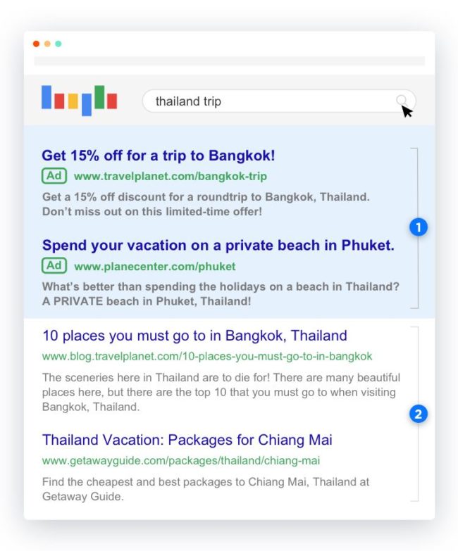
That is—your website is mainly a means for attracting organic traffic. In this case, Google selects and serves up links on your site believed to be the best match for a given search query, and these Google-chosen links are served up in the bottom half of the SERP (see section 2 in the image to the right). This organic traffic is largely why you need a terrific website optimized for search.
But with paid advertising on Google Ads or Bing Ads, you get to choose where to direct visitors (section 1 of the SERP).
You can decide to link this paid traffic to your website’s homepage, for example, (and many marketers do) but this isn’t actually your best option when it comes to conversion.
Content on your homepage—or even other site pages—often doesn’t match the premise of your ads in all cases and won’t always contain info or a call to action tailored to your initial ad campaign.
As many advertisers eventually discover, paid traffic pointed to generic web pages (like a website homepage, for example) doesn’t convert well and can drive up cost-per-click. This is mainly because visitors often can’t find what they specifically searched for on the generic page and typically bounce more quickly (signaling to Google the landing page experience wasn’t very good).
On the other hand, if visitors click through from an ad to a highly relevant landing page, they’re met with information that reinforces the promise of the ad, and they encounter just one call to action or next step to take. By simplifying the options available, you help ensure a smoother path to conversion.

As pictured above, the website homepage doesn’t match the search ad’s intent or copy, and encourages exploration. Whereas the landing page speaks specifically to the ad’s message and encourages conversion via just two focused calls to action.
In an analysis of 455 pages, we saw on average that dedicated landing pages converted 65% higher than website pages.
How to create a PPC landing page for Google Ads
When it comes to creating the ideal PPC landing page, speed is key. That’s where automation comes into play. We bet an AI landing page builder sounds great right now.
Here are just some of the reasons the Unbounce builder would be a great choice:
- User-friendly Interface: You get to unleash your creativity effortlessly with an intuitive drag-and-drop builder that caters to all levels of expertise.
- Customizable templates: You can choose from a diverse range of industry-specific templates, ensuring your landing page aligns seamlessly with your brand.
- Swift workflow: You can speed up your campaign timeline by quickly implementing changes, conducting A/B tests, and optimizing pages for maximum impact.
So if you want to unlock the efficiency and excellence in crafting PPC landing pages with an AI landing page builder, here’s a step by step guide on how to create the PPC landing pages you’ve been dreaming of for Google Ads.
Bonus: Google Ads rewards those serving up PPC landing pages
Not only does a landing page allow you to present a focused, carefully selected call to action, and customize the experience you present on click through to match the expectations set up in your ad, but if you pair every PPC ad with its own hyper-relevant, standalone landing page, you can:
- Achieve a higher Google Ads Quality Score (in turn boosting your Ad Rank and your Search Impression Share, getting your ads served up more often)
- Lower your cost-per-click
- Lower your cost-per-acquisition, and
- Increase conversions on the offers you run with paid
As many marketers using a landing page builder can confirm, they’re able to drive the same amount of traffic to a landing page for Google Ads and see far better results because of the page’s refined focus:

“With Unbounce, we were able to test all the way up to 20-22% conversion rates. Without driving any more traffic, the client’s getting four times the leads that he was getting prior.”
— Andrew Miller, Co-Founder, Workshop Digital
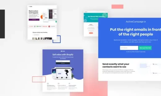
Seven pay-per-click landing page examples for Google Ads
It’s one thing to know what elements go on a landing page for Google Ads, but what do some of the best PPC landing pages actually look like in practice?
Fortunately, 14,000+ amazing brands have been using the Unbounce landing page builder over the last eight years to create on-brand, high-converting masterpieces, so we have a lot of examples to share.
Here are a few you can use as inspiration from real estate, home improvement, SaaS, and more:
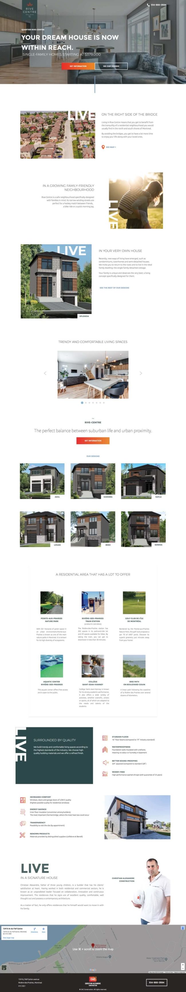
Example 1: Real estate PPC page from Rive Centre
Company: Rive Centre – a real estate brand for new and affordable family homes in Montréal
Unbounce Landing page built by: Digital agency Webistry
Conversion type: Lead generation (in this case, for large-scale commitment)
Landing page conversion rate: 0.31%
Click-through rate on the search ad: 3.5%—10% in some Ad Groups
Cost-per-click before use of landing page: $2.00
Cost-per-click after use of landing page: $1.50
Search Ad leading to the landing page:
The Unbounce landing page
Click the image above to see the full page.
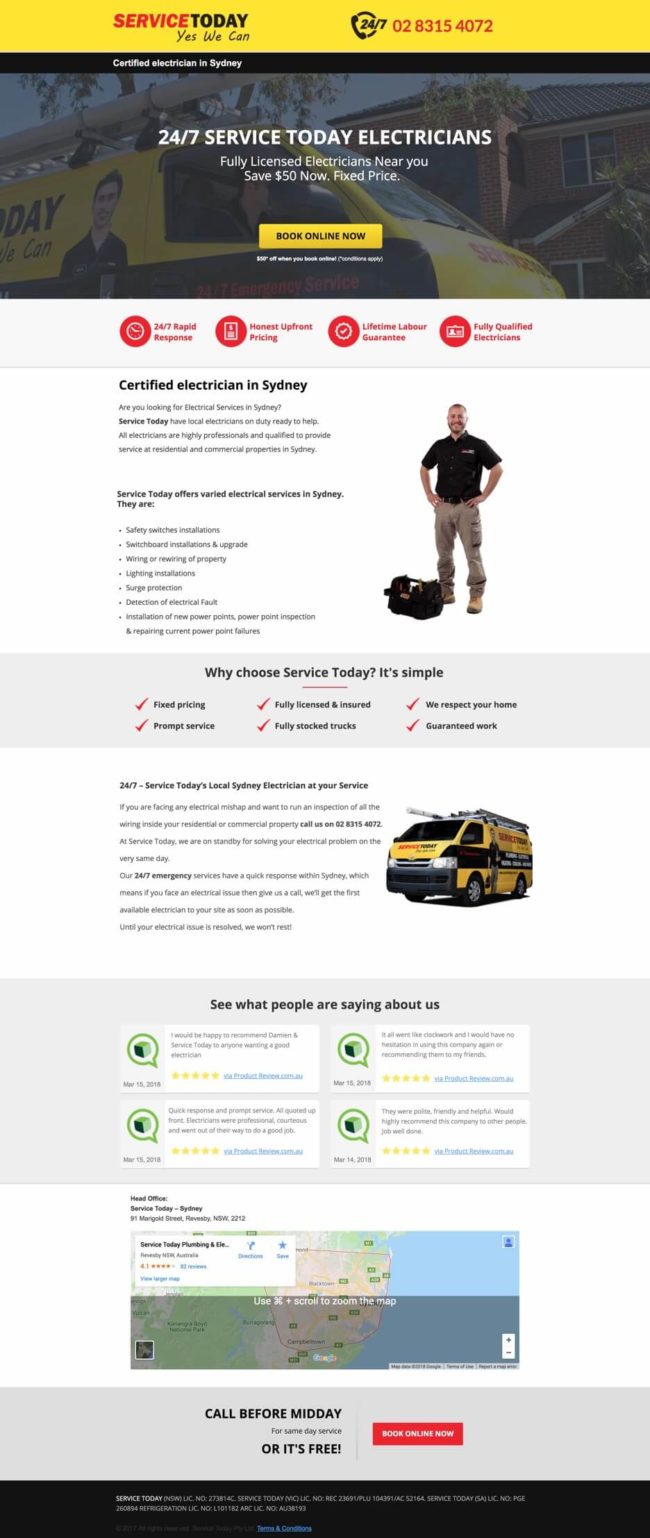
Example 2: Home improvement services PPC page from Service Today
Company: Service Today
Conversion type: Lead generation (book an appointment now)
Landing page conversion rate: 10.54%
Click-through rate on the search ad: 3.92%
Cost-per-click before use of landing page: ~$16
Cost-per-click after use of landing page: ~$13
Cost-per-acquisition: Improvement by 30%
Search Ad leading to this page:

The Unbounce landing page:
Click the image above to see the full page.
Example 3: Automation software PPC page from MonkeyLearn
Company: MonkeyLearn
Conversion type: click through (request a demo, or read a blog post)
Landing page conversion rate: 2.55%
Click-through rate on the search ad: 5.27% avg
Cost-per-click after use of landing page: $0.53 avg
Search Ads leading to this page:

The Unbounce landing page:
Click the image above to see the full page.
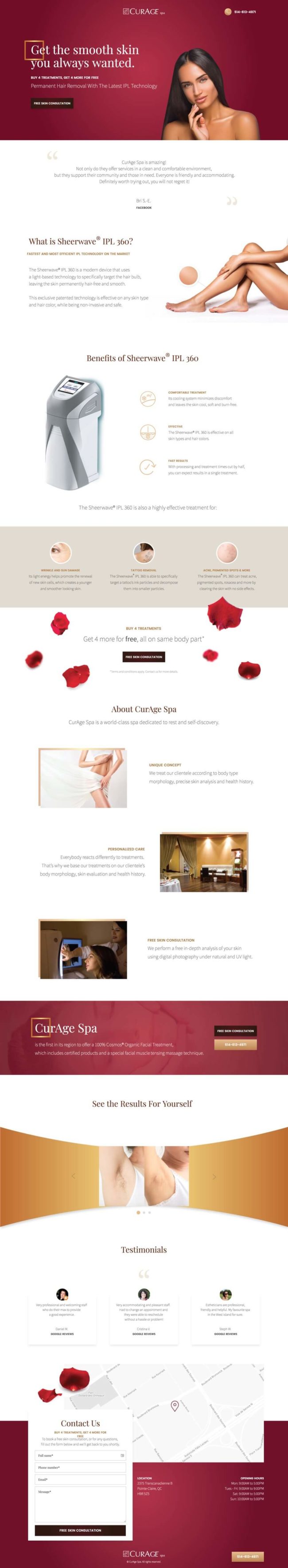
Example 4: Aesthetician services PPC page from CurAge Spa
Company: CurAge Spa
Landing page built by: Digital agency Webistry
Conversion type: lead generation (free skin consultation lead form + click to call)
Landing page conversion rate: 2.19%
Click-through rate on the search ad: 1.83%
Search Ads leading to this page:

The Unbounce landing page:
Click the image above to see the full page.
But how have other brands played the PPC landing page game? Let’s dive deeper into the thrilling world of PPC landing pages and see how other brands have aced the game with their ingenious strategies. Here are some examples from some of the coolest brands in the digital realm.
Example 5: Mailchimp “Landing pages” PPC landing page
Mailchimp knows what they’re doing (as always.) They perfectly capture anyone looking for “landing pages” by using that very keyword within their messaging.
Once you click on the ad and find your way to the landing page, Mailchimp continues to deliver on its promise, giving the searcher exactly what they came for. On their landing page, you’ll find all the information you need around landing pages, from templates to use to how to publish your first page.
Search Ads leading to this page:
The Unbounce landing page
Click the image above to see the full page.
Example 6: Uber “Request a ride” PPC landing page
Uber‘s PPC landing page is a masterclass in direct action, whisking you away to a realm where the simple act of “requesting a ride” becomes a seamless experience. Beyond merely providing information about Uber and its platform, a single search catapults you into action, putting you at the helm of a ride request in the blink of an eye. It’s not just a PPC landing page; it’s a portal of instant gratification. In a digital landscape crowded with distractions, Uber’s approach stands out like a beacon of clarity and purpose, driving users toward their desired destination. Literally.
Search Ad leading to this page:

The landing page:
Click the image above to see the full page.
Example 7: Aura “Meditations” PPC landing page
Looking for guided meditations? The second you search that on Google, Aura‘s got you covered. Aura uses keywords like “guided meditation” and “meditation” and leverages them in their PPC ad. Also, did you catch that they’re “Apple’s Best of Apps Winner?”
Search Ad leading to this page:


 The game-changing value of landing pages and why they work so well with ads really boils down to the difference between