
It can be difficult to convince someone to sign up for a service based on a landing page alone. That’s why marketers tend to focus on using content like ebooks, webinars and other resources to collect leads at the top of the funnel, and then nurture them into paying customers later on.
But some of your potential customers are ready to start right now, and losing a lead that’s ready to get going — and potentially start paying — is a heavy loss. That’s why having a killer landing page that sells your SaaS product on its own is so important.
To demonstrate, we’ve collected landing pages from six prominent B2B software companies and broken down what makes their pages so great … and not-so-great.
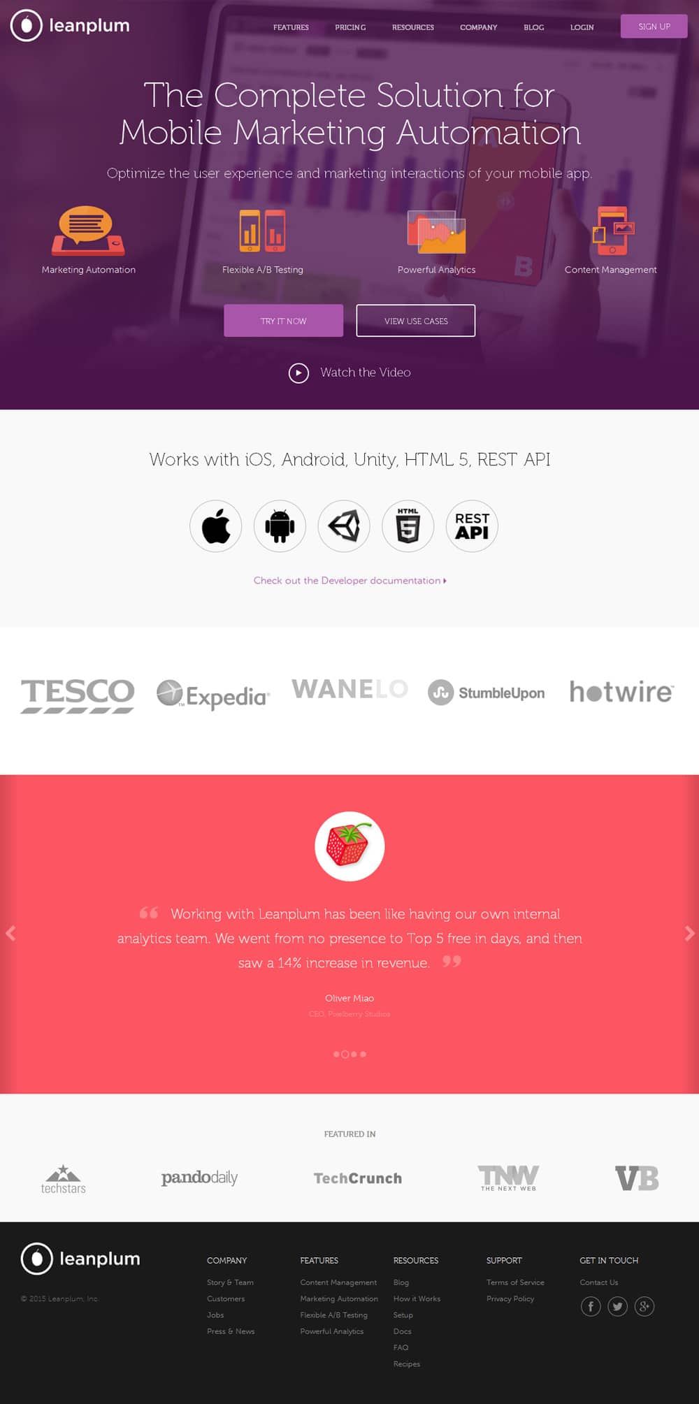
#1: Leanplum — Mobile Marketing Automation
Converting with contrast
This landing page from Leanplum makes a powerful first impression, with a bold color palette of purple, orange and pink. In particular, the orange serves as the perfect accent color to the dominating purple.
While the palette itself is beautiful, the implementation of it has room for improvement. The element that needs to stand out the most — the call to action — is also purple, causing it to blend right into the rest of the page. Reserving the orange for use here, or finding another colour that would clearly contrast against the rest of the page’s palette would go a long way.
Don’t rely on video alone
Adding a new colour is pretty easy, though. The bigger problem with this page is its complete reliance on video as a way of delivering information about the product.
Leanplum allows app developers to A/B test in-app content, segment audiences and deliver personalized messages and notifications.
But other than the callout to its own development documentation, this page doesn’t mention any of Leanplum’s features nor benefits. This information is only in the video, linked to by a tiny line of white text.
Not everyone wants to watch video, or is in a situation where watching it is comfortable. So while video on your landing page can often be an incredibly persuasive lead-generation tool, it’s also one that should complement the rest of your page’s content, not replace it.
This page would be massively improved by the addition of content that says more about the product, rather than relying on the video to do all of the heavy lifting.
Navigation naggery
There’s one other big problem in this page, and if there’s a cardinal sin of landing page design, this is it: the navigation.
A landing page is not a gateway to your website, but a destination in its own right: the user gets what they need, and they grant you their email address in return.
Once you have that, you can nurture them into paying customers. But if your website’s navigation is on your landing page, you’re inviting the prospect to leave the page, meander about, and perhaps lose interest altogether. You could lose their attention.
In a well-optimized campaign, the ratio of links to conversion goals on your landing page — its attention ratio — should be 1:1.
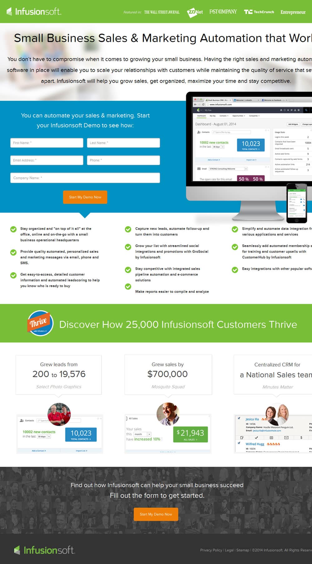
#2. Infusionsoft — Sales & Marketing Automation
It’s not proof without evidence
This landing page from Infusionsoft has some of the best customer testimonials I’ve ever seen.
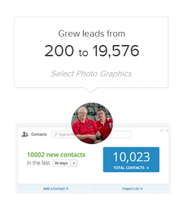
Not only do they display incredible growth with precise metrics — from 200 to 19,576 leads, for example — they actually show the elements of their product’s interface that convey this information.
It’s a great way of incorporating social proof while also communicating the product’s functionality and its hand in increasing those metrics.
Structure your copy for skimming
The testimonials are also, unfortunately, the only element of this page that’s been given any space to breathe.
There is simply too much text crammed into too small of a space literally everywhere else on the page. The fact that the hero shot is a screenshot that’s also jam-packed with text makes this page impossible to understand at a glance.
Furthermore, the majority of the heavy-lifting done by content on this page is in the form of a bulleted list with no categories or headings, and an identical checkmark image placed next to each one.
This makes it impossible to skim the page and understand what it’s about, which is how people actually read on the web. In one of the most definitive and heavily-cited studies on how users consume text on the web, Jakob Nielsen of the Nielsen Norman Group writes:
In research on how people read websites we found that 79 percent of our test users always scanned any new page they came across; only 16 percent read word-by-word.
This is why headings, strategically emphasized text and recognizable icons are important: they make it possible for the user to skim the page and find information that’s relevant to them.
#3: Domo — “Cloud-Based Business Management Platform”
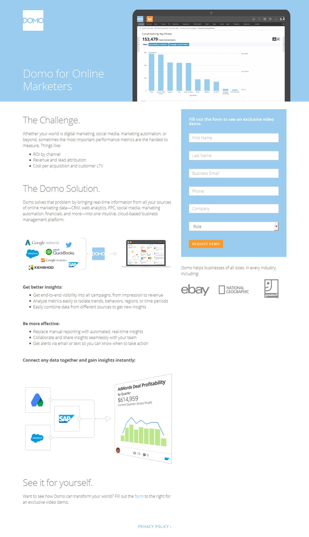
Okay! I’m here, I’m strapped in, and I’m ready to be delivered some value. Let’s see what Domo has for me!
“Domo for online marketers.”
… Okay.
“The Challenge.”
What? Who are you? Why am I here? What’s happening?
It’s not until I finish reading the entire first section of the page that I get an inkling as to what this product might be for, and I’m still not totally convinced. Yeah, knowing my ROI on a per-channel basis seems great, but how? And to what end? What is Domo and how will it help me?
As Joanna Wiebe once put it, a headline’s only goal is to keep the reader on the page. Once you’ve captured their attention, you’ve earned the opportunity to go more in-depth and offer a real argument as to why you’re the right fit.
But Domo never tries to earn that opportunity. This page seems to assume that you already know what its product is and the value that it can provide.
And that is an assumption that no business should ever make.
#4: Emma — Email Marketing

This landing page for Emma’s email marketing and automation platform is long. Nobody can say whether this is a positive or negative without testing it, but at least Emma uses the length as best as it can, giving a detailed overview of the product’s features and benefits without ever feeling overwhelming.
Even if you skip the video, many of the image examples on this page are animated and show the great fluidity of Emma’s interface.
While this page has tons of great stuff on it, I really wish Emma made a stronger first impression.
“The power of automation, the simplicity of Emma,” sounds like a great tagline for a movie about a marketing automation AI gone rampant, but it doesn’t communicate the value that the product will provide to the user.
Then the next block compels you to watch the video, promising that email automation doesn’t have to be complicated to be powerful. This is closer to communicating the product’s value, but it’s barely visible and exists solely to compel you to watch a video you may or may not want to actually watch.
What does my business need from email marketing? And how can Emma help me accomplish it? These are the questions that Emma needs to answer, ideally as close to the top of the page as possible.
#5: Constant Contact — Email Marketing
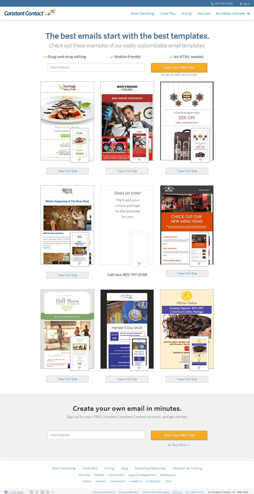
Working at Unbounce, you see a lot of landing pages. And often, those landing pages are very, very good. But it’s pretty rare that you see one that makes you go, “Whoa, this is brilliant.”
But whoa, this is brilliant. (Except for that navigation — do we have to do this again?)
Constant Contact is an immensely popular and powerful email marketing platform, and yet this landing page focuses on just one aspect of the product, and does it well. This landing page is targeting people who are searching for email templates, not email software.
The value proposition — “The best emails start with the best templates” — is relevant precisely to what the visitor is searching for, and the page then lists the three most relevant features:
- Drag-and-drop editing
- Mobile-friendly
- No HTML needed
Not only does Constant Contact promise you the best emails, but it promises you can create mobile-friendly ones with no technical knowledge.
But this page really seals the deal with this one non-template inclusion:
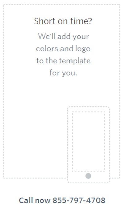
Wisely guessing that some of their audience might be marketers who are too busy to create a custom template for their company’s emails, Constant Contact offers to do it for them. They’ve found a smart way to do something we wouldn’t typically recommend: adding an alternative call to action — phoning directly — without it detracting from the primary CTA to start a free trial.
This ultimately hurts the page’s attention ratio, but testing ideas that fall outside the realm of best practices is something that every conversion optimizer should be doing.
This is one of the best examples I’ve ever seen of a landing page designed to acknowledge and eliminate a doubt in one fell swoop. In this case, the user’s doubt is “Do I have the time and/or resources for this?” By saying that they’ll do it for you, and presenting the option to phone them immediately, both of those doubts are quashed.
#6: Autopilot — Marketing Automation (1v1 Comparison)
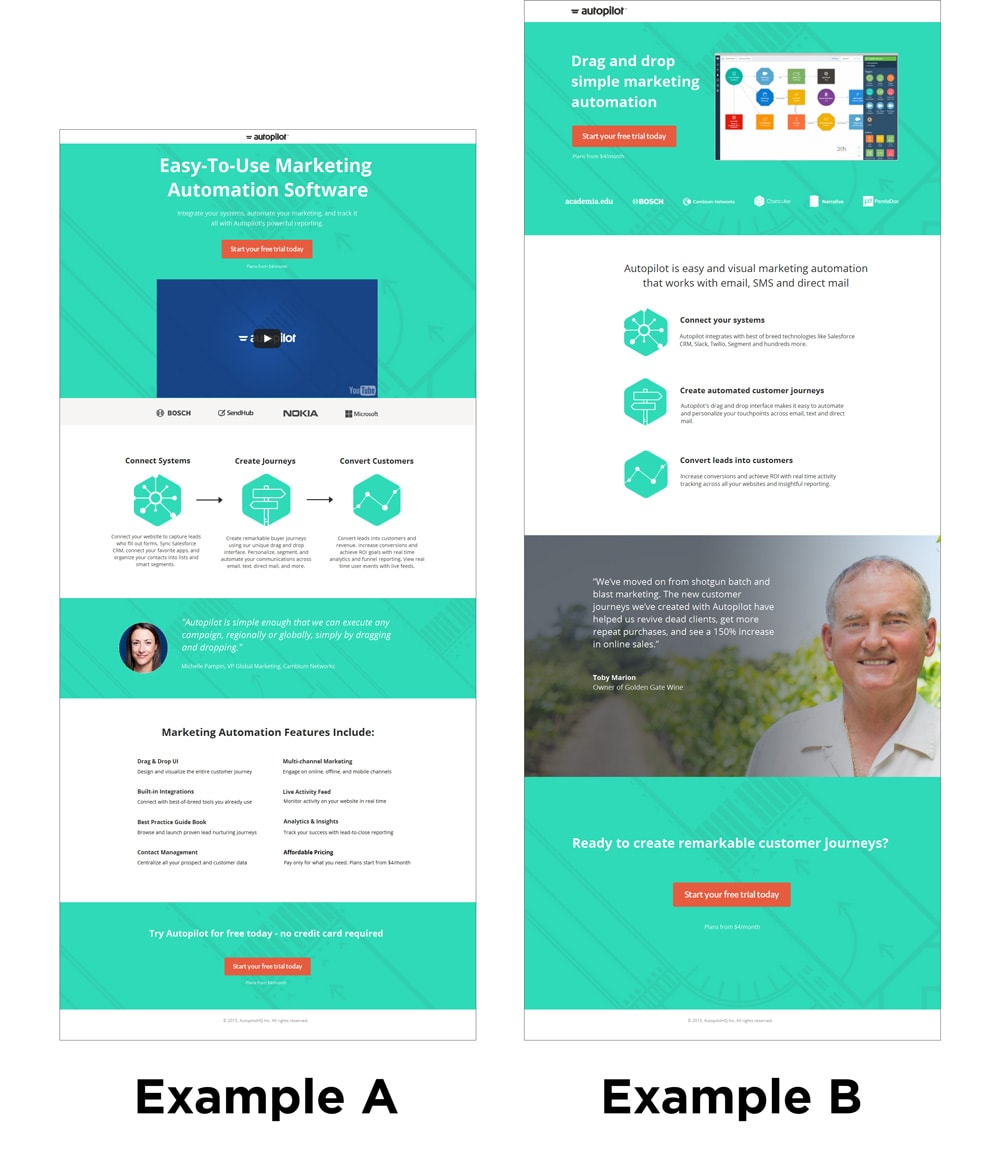
In this next example, we’ll take a look at two landing pages selling Autopilot’s marketing automation platform and how they compare against each other.
Example A really feels like the most boilerplate of the two. There’s a headline that promises “Easy-to-Use Marketing Automation Software,” which is, by any measure, fairly uninspired. There’s a ton of companies selling marketing automation software, and all of them would like me to believe that their solution is the easiest to use. But what actually makes it easy to use?
Example B does a much better job in communicating the product’s core benefit:
Drag and drop simple marketing automation.
The word “simple” seems very out of place here, but this headline still succeeds over the other because, in conjunction with product screenshot, it allows me to visualize what makes this platform easy to use.
In general, Example B seems to take a more thoughtful approach to its copy. Rather than pushing all of the product’s features, it focuses on three key benefits that are easy to remember.
After hooking you with the promise of drag-and-drop marketing, the subhead elaborates on the value proposition: “Autopilot is easy and visual marketing automation that works with email, SMS, and direct mail.” And the testimonial does a much better job conveying the product’s worth, by clearly explaining what the customer did and what they achieved as a result.
My only wish is that “no credit card required” stuck around for Example B, too. The fear of having to enter payment information to try a piece of software creates real friction, so it’s worth it to eliminate that fear before it can take hold.
Which landing page would convince you to give Autopilot a try?
Tell me why I’m here
Perhaps the most difficult part of making a landing page for a software product is that those products tend to have a litany of features and use cases. Communicating their value in concise way can seem like an insurmountable task.
That’s why it’s so important for your landing page to lead with the customer and not the product. Your audience isn’t made up of “people” who need “software.” It’s made up of Linda, who’s looking to implement her first drip-nurturing strategy. It’s Craig, who’s grappling with a surge in leads with no way to grade them.
It’s thousands of individuals, each with their own individual need; it’s up to you to address that need as quickly as possible.
It’s up to you to tell them why they’re here, and make them happy they came.

