Some marketers do an excellent job of laying out information on their landing page so that it tells a story in a way the reader needs to hear it. Not only does that yield awesome conversion rates, it creates an experience for the reader that feels effortless.
Other times, information is presented in a way that feels disjointed or out of order.
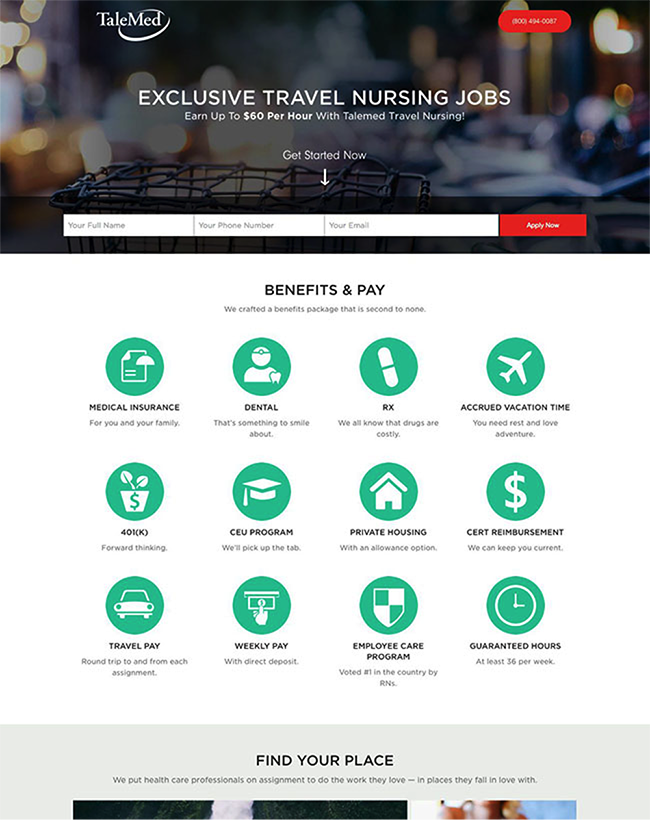
Have a look at this example, which invites people to “get started” without really explaining what “travel nursing jobs” are. They only clarify their unique value proposition below the fold: “We put health care professionals on assignment to do the work they love — in the places they fall in love with.”
Before you ask prospects to convert, you need to explain what your offer is.
Heck, before you even begin to talk about yourself, you need to show prospects that you understand their anxieties — and you must address their objections as they spring up, telling them exactly what they need to hear when they need to hear it. This includes omitting unnecessary information that doesn’t address an actual question in your prospect’s mind.
If that sounds like a tall order, we’ve got a simple solution:
Information hierarchy: the practice of laying out your information so that it answers all your prospects’ questions in a logical order.
And once you get a hang of it, you’ll be weaving a tale on your landing page that has your prospects nodding “yaassss.”
What is information hierarchy in visual design?
Information hierarchy is the art of organizing content so users can digest it naturally, without thinking. It’s how designers guide visitors through landing pages by controlling what they see first, second, and third—creating an intuitive flow.
Think of it as creating a visual roadmap for your visitor’s eyes.
When done right, information hierarchy does the heavy lifting for your users. They don’t have to work to understand your page—everything just makes sense. Your headline captures attention, your subheadlines build interest, your body copy addresses concerns, and your CTA feels like the natural next step.
Here’s the thing: our brains crave order. We’re hardwired to look for patterns in what we see. When your landing page has clear visual hierarchy, you’re working with this natural tendency instead of fighting it.
Good information hierarchy isn’t just about making things pretty—it’s about creating meaningful connections between elements that guide users toward conversion.
Is information hierarchy different from content hierarchy or visual hierarchy?
Let’s clear up some confusion, because these terms get mixed up all the time.
Information hierarchy is your overall strategy—it’s the master plan for what gets communicated when. It answers the big question: “What does my visitor need to know, and in what order?”
Content hierarchy is about structuring your written elements. It’s how you organize your headlines, subheadlines, body copy, and calls to action to tell a cohesive story that moves people toward action.
Visual hierarchy? That’s how you use design elements like size, color, contrast, and spacing to direct the viewer’s eye. It’s the visual implementation of your information strategy.
The magic happens when all three work together. When your content structure and visual design perfectly support your information strategy, you get a landing page that feels almost invisible—in the best possible way.
Think about it like this:
-
Information hierarchy determines what you say and when
-
Content hierarchy organizes your written narrative
-
Visual hierarchy ensures your design elements guide the eye appropriately
The most powerful landing pages align all three perfectly. Your visual design amplifies your content flow, which in turn supports your overall information strategy.
That’s why truly great landing pages don’t feel designed at all—they just feel right.
Why some landing pages feel effortless — and others fall flat
Ever landed on a page that just… flows? Where you find yourself nodding along, questions answered before you even ask them?
That’s information hierarchy at work.
But let’s be real — for every landing page that feels like magic, there are dozens that make your brain hurt. You know the ones. You land on them and immediately think: “What am I even looking at here?”
Here’s the thing: when a landing page feels confusing, it’s not your fault as the visitor. It’s because the creator missed something fundamental about how our brains process information.
Think about the last time you hit a landing page and bounced faster than a caffeinated kangaroo. Was it because:
-
You couldn’t figure out what they were selling?
-
The value wasn’t immediately clear?
-
Important details were buried way down the page?
-
There were too many competing elements fighting for your attention?
Yep. All hierarchy problems.
When a landing page feels like work, visitors bail. It’s that simple. Your prospects aren’t going to solve puzzles to figure out your value proposition. They’re not going to scroll through paragraphs of corporate jargon hoping to eventually stumble on the information they actually need.
They’re going to click the back button.
The difference between an effective landing page and a dud often comes down to this: one presents information in the order visitors naturally need it, and the other… doesn’t.
Bad hierarchy creates cognitive friction. It forces visitors to work harder to understand what you’re offering. And in a world where attention spans are measured in seconds, that extra mental effort is a conversion killer.
Great landing pages feel effortless because they meet users exactly where they are in their thought process. They anticipate questions as they arise and answer them in the natural order visitors would ask them.
It’s like having a conversation with someone who just gets you — versus talking to someone who keeps changing the subject mid-sentence.
Want to create pages that feel frictionless? Start by putting yourself in your visitor’s shoes. What’s the first thing they need to know? What comes next? What objections will pop up along the way?
Nail that sequence, and your landing page will practically convert visitors on autopilot.
How to create visual hierarchy on landing pages
Ready to transform your landing pages from “meh” to magnificent? Let’s talk about how to create visual hierarchy that guides your visitors exactly where you want them to go.
As marketers, we need to control the journey our visitors take through our pages. Without clear visual hierarchy, even the most brilliant copy falls flat because people simply don’t know where to look first.
Here’s how to create visual order that feels natural and directs attention to what matters most:
Use font size and weight to signal importance
Your typography isn’t just about looking pretty—it’s a powerful tool for directing attention.
Think of your text elements as having different “volume levels.” Your most important messages should speak the loudest through larger sizes and bolder weights. Secondary information can use medium weights, while supporting details work best in regular or light weights.
For example:
-
Make your main headline 2-3 times larger than body text
-
Use bold weights for key benefits or unique selling points
-
Keep supporting copy in standard weights
-
Consider using lighter weights for less critical information
This natural size progression creates a visual rhythm that tells visitors exactly what to read first, second, and third. No instructions needed—their eyes will follow your lead.
Remember, contrast matters more than absolute size. The difference between elements creates the hierarchy, so make sure there’s clear distinction between your levels.
Use color and contrast to draw the eye
Color isn’t just decoration—it’s direction.
Our eyes are naturally drawn to elements that stand out from their surroundings. Use this to your advantage by applying color strategically:
-
Choose a high-contrast color for your most important elements (like your CTA button)
-
Use your brand’s primary color to highlight key benefits or statistics
-
Keep secondary information in more neutral tones
-
Create contrast between text and backgrounds for easy reading
Remember that one brightly colored element on a neutral page will naturally draw the eye. But if everything is colorful, nothing stands out.
Pro tip: Use your most vibrant, contrasting color only for elements you want visitors to interact with, like buttons or links. This creates what we call “action colors” that subconsciously signal “click me!”
Apply spacing and alignment with visual elements to guide flow
White space isn’t wasted space—it’s breathing room that creates relationships between elements.
The closer items are positioned to each other, the more related they seem. Use this principle to:
-
Group related content together with less space between elements
-
Separate different sections with generous margins
-
Create natural reading paths with left-aligned text (for languages read left-to-right)
-
Use consistent spacing patterns to establish rhythm
The strategic use of white space creates what designers call “visual breathing room.” It lets important elements stand out while giving your visitors’ eyes a chance to rest between key points.
One mistake we often see? Cramming too much information too close together. When everything screams for attention, nothing gets heard. Instead, embrace negative space—it makes what remains feel more important.
The best part about implementing these visual hierarchy techniques? They work on a subconscious level. Your visitors won’t consciously think “oh, this headline is larger so I should read it first”—they’ll just naturally do it.
Remember: the goal isn’t to make your page look pretty. It’s to create a visual path that guides visitors through your content in exactly the order needed to convince them to convert.
Design principles that support better hierarchy
Let’s explore the building blocks that support great information hierarchy. These principles aren’t just designer jargon—they’re practical tools you can use right now to make your landing pages more intuitive and higher-converting.
Proximity, grouping, and white space
Ever notice how your eyes automatically group things that sit close together? That’s proximity at work—and it’s one of your most powerful tools for organizing information.
When elements are physically close, our brains assume they’re related. Simple, but game-changing when you put it into practice.
Here’s how to use it:
-
Place related content closer together than unrelated content
-
Create distinct “content islands” with generous white space between sections
-
Use consistent spacing patterns to establish visual rhythm
White space isn’t empty space—it’s breathing room that helps visitors process what they’re seeing. Think of it as the silence between musical notes. Without it, you just have noise.
The best marketers use white space strategically to:
-
Highlight important elements by isolating them
-
Reduce cognitive load by breaking content into digestible chunks
-
Create natural pauses that guide visitors through the page
Remember: cramming more elements into your page won’t make it more effective. Often, it’s what you remove that makes the biggest difference.
Consistency and repetition
Want to know the secret to making your landing pages feel professional? Consistency.
When your visual elements follow predictable patterns, visitors can focus on your message instead of figuring out your design. It’s like having a conversation without constantly changing the subject—it just flows better.
Here’s where consistency matters most:
-
Typography: Use the same heading styles throughout
-
Colors: Limit your palette and apply it consistently
-
Button styles: Your CTAs should look like they belong to the same family
-
Spacing: Use consistent padding and margins
Repetition takes consistency a step further by deliberately echoing visual elements to create unity. When you repeat colors, shapes, or font treatments across your page, you’re subtly telling visitors “these things are connected.”
This doesn’t mean being boring. You can create consistency while still having visual interest—just make your variations intentional and meaningful.
Pro tip: Create a simple style guide before you build your page. Even a basic one with heading styles, button treatments, and color codes will dramatically improve your consistency.
Avoiding visual clutter that distracts from key messages
Most landing pages have way too much stuff on them.
Every element you add to your page is competing for your visitor’s attention. And when everything screams for attention, nothing gets heard.
The most effective landing pages embrace simplicity. They ruthlessly eliminate anything that doesn’t directly contribute to conversion.
Ask yourself:
-
Does this image help visitors understand our value proposition?
-
Does this paragraph address a specific objection or answer a crucial question?
-
Does this icon clarify meaning or just look decorative?
If you can’t justify an element’s existence in terms of how it helps conversion, it’s probably clutter.
Visual noise comes in many forms—busy backgrounds, decorative elements with no purpose, unnecessary illustrations, or even just too many colors and fonts. Each one creates tiny bits of friction that add up.
Remember: the goal isn’t to make your page look impressive. It’s to make your message impossible to miss. Sometimes the most powerful design move is deleting something. Be brave enough to simplify.
A simple but effective information hierarchy for your landing pages
Information hierarchy is so important that it’s the first thing I consider when creating any marketing asset, from an ad to a blog post to a website.
But we’ve also seen many, many, many landing pages. As a result, we’ve picked up a go-to hierarchy framework you can use as a starting point. In a note or brainstorm doc:
-
State how the offer relieves a specific pain for the reader
-
Explain what the offer will allow that person to do (the benefit)
-
Explain why you are uniquely positioned to provide the offer (why you have the best solution)
-
Address the most common objections that people often have before they’re willing to accept your offer
-
Tell people how they can get offer (the call to action)
-
Provide social proof from people just like the reader, or from people they know and admire
Only when you have that foundational information in place should you start writing copy and designing the page.
Often, you can dedicate a page section to each one of those topics, keep it in that order and call it a day. However, depending on the complexity of the offer, the assets you have at your disposal (like a sweet image or explainer video) or the objections you know the audience will hold, you may choose to rearrange the order or use a different format than text.
The above hierarchy is great as a jumping-off point, but depending on your unique audience, mileage may vary. So don’t forget to test.
Information hierarchy examples (and why they work)
Want to know what all of this looks like in practice?
Below are a few examples of information hierarchy done right.
Example 1: Logi Analytics
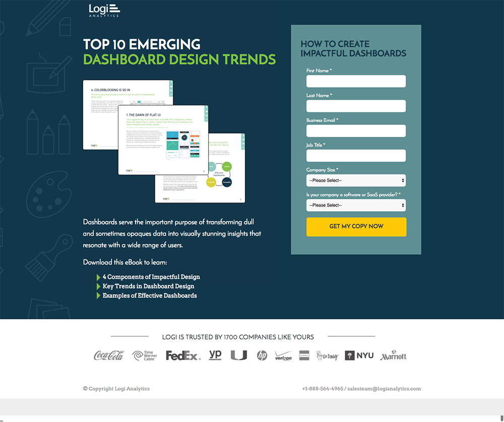
Logi Analytics has managed to pare down the amount of information on the page to include only what’s necessary to convince the right audience member to download their ebook.
They’ve structured it all so that it reads like a pitch that starts with the promise of learning new information and ends with instructions on how to get it:
- A headline promising a book with brand new, never before seen “emerging design trends”
- A hero shot showing a sneak preview of what you’ll get
- A description that digs deeper into what the book contains
- A bulleted list that describes the benefits (you’ll learn…)
- Social proof, promising that other people trust Logi
- A form headline that reassures you that you can apply the information easily
- A CTA describing how to get the ebook
The only thing we’d recommend is a link to their privacy policy positioned near the email field to satisfy those who need assurance that their information will be handled responsibly.
Example 2: Ten-X
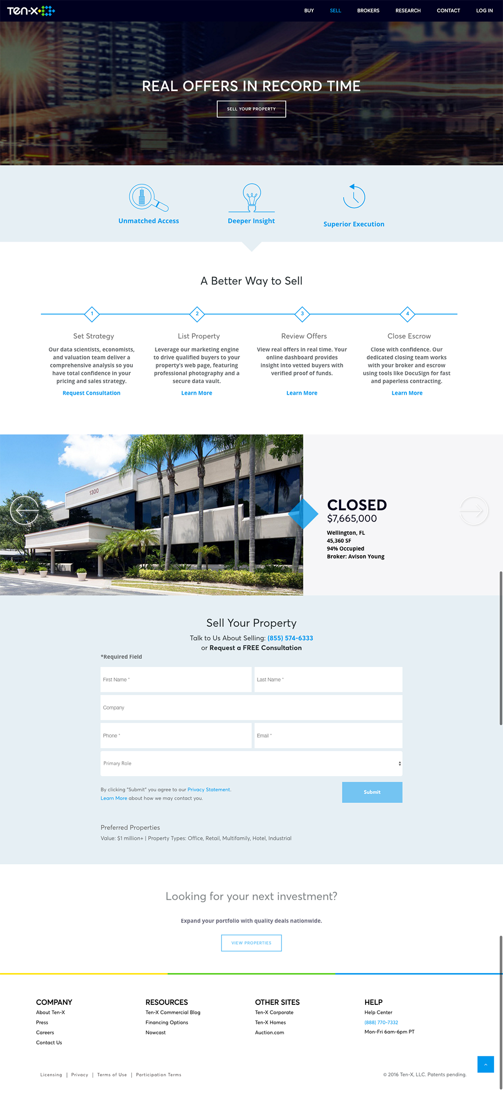
Ten-X clearly understands what their potential clients want: offers on the commercial property they’re selling. Though Ten-X also offers services for brokers, they know that the people who are looking at this page — the people who are selling commercial properties — don’t need to know it. So they’ve hidden broker information and focus instead on catering to only one audience.
Additionally, Ten-X focuses only on the next step for readers, displaying only enough information to sell the reader on why they should get a free consultation.
Their copy reads like a persuasive pitch taking someone from “I need to get offers on my commercial property” to “here’s how I can get started.” Here’s how they take someone through that thought process step by step:
- A headline that promises clients will get offers. Fast.
- A benefits section that shows why Ten-X is better than the alternatives (These sections actually display more information on click — I’d recommend making that more obvious.)
- A succinct explanation of how the process works
- Social proof, providing confidence that others have found success with Ten-X
- A form header/subhead reassuring prospects that they can start the process for free, with no risk
- A disclaimer at the end with the qualifier “By the way, we have minimum deal sizes.” I love the placement of this information. It’s important to qualify the quality of the leads, but they don’t want to waste valuable page real estate with it. They bring it up only after the prospect has made their decision. If you have a low-value property, you might be upset about it… but who cares? You can’t become a client anyway.
Bonus tip:
What’s the common thread between this example and the one above? Both companies have considered what the reader needs to know in order for them to make the next important decision — and the next decision only.
Turn your information hierarchy from concept to conversion machine
You’ve done the hard part.
You’ve mapped out your perfect information flow. You know exactly what your visitors need to see and when they need to see it. Now comes the fun part—actually bringing it to life.
But here’s where things get sticky for most marketers.
You’ve got this beautiful information hierarchy sketched out, but when you try to implement it? Your CMS fights you every step of the way. You can’t get that section to appear exactly where you want it. Your headline styling is locked into the theme settings. And that perfect visual flow you planned? Good luck making that happen without begging a developer for help.
We’ve been there. Done that. Got the frustration t-shirt.
That’s exactly why we built Unbounce to be the information hierarchy playground you’ve been dreaming of.
Want to move that testimonial section above the features? Drag, drop, done. Need your headline to be 20% bigger than your template allows? Click, adjust, save. Want to test if your information flow works better with benefits before features? Create a variant in seconds.
No code. No developers. No compromises.
The truth is, all that hierarchy planning means nothing if you can’t execute it exactly how you envisioned it. And most traditional website builders just weren’t made with conversion in mind.
Here’s what makes Unbounce different:
- Complete drag-and-drop freedom with our Landing Page Builder — Place any element exactly where your hierarchy demands it
- Smart Traffic that automatically routes visitors to the page variant that matches their preferences
- Built-in A/B Testing so you can see if your hierarchy actually converts
- AI copywriting assistant to help craft messages that fit your hierarchy perfectly
- Over 100+ Landing Page Templates with information hierarchy baked right in
Not just landing pages, either. Need to highlight key information without disrupting your flow? Our Popups & Sticky Bars let you layer information strategically—perfect for those “by the way” messages that shouldn’t break your main hierarchy.
And the best part?
You can build your page in the time it takes most developers to read your brief.
Because let’s be real—your brilliant information hierarchy shouldn’t be sitting in a Google Doc gathering digital dust. It should be out there working for you, capturing leads, driving sales, and making you look like the marketing genius you are.
Ready to turn your information hierarchy theory into conversion reality? Try Unbounce free for 14 days.
No credit card required. Just pure, hierarchy-respecting, conversion-optimized goodness.
