Infographics are awesome. Why? A couple of reasons. Some people love them and some people hate them. While it’s fun to debate, it’s hard to argue that a well executed infographic isn’t more enjoyable as a learning tool compared to dull monotonous copy. They can also do wonders for your marketing.
The thing is, many marketers don’t know how to get the best out of infographics and reap the benefits available. The primary benefits being the generation of inbound links and making your posts incredibly sharable.
Over the next 5 days we’ll be doing an infographic deep dive.
- Day One: Today we’ll learn 12 ways to market an infographic including;
- Building your own
- Create content that people actually want
- Infographic research
- If you find data, add it – otherwise just make something epic
- Infographic Design & Data Visualization
- Add an embed code to let others re-post it
- Making your Infographic go Viral
- Using your network
- Borrowing one from someone else
- Finding Infographics
- Adding value
- What’s the proper etiquette for re-using others work?
- Things you should do for all infographic posts
- Add Pin It buttons
- Tweetables: Set up important and entertaining stats formatted as Tweets
- Building your own
- Days Two-Five: Then for the next 4 days we’ll share a new infographic each day and use the techniques described below to make them as effective as possible.
Download the 12-step guide as a PDF
If you like it, please share on Twitter of Facebook as a thank you – hope you enjoy.
The Ultimate Guide to Marketing with Infographics (pdf)
Building Your Own Infographic
This is the ideal method, but it’s not always possible (time, money, design talent), but if you can make them yourself, then it’s way better. Here are a bunch of tactics for how to do it right, and later on we’ll talk about the alternatives.
1. Create content that people actually want
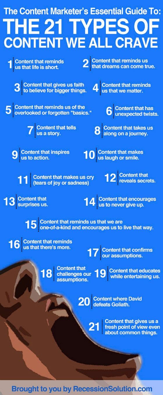
The graphic below (let the fighting begin about whether it’s an infographic or not – #NoData) describes the types of content you should aim to include on your infographics to make them effective.

Key Lessons
#1 – Bucket Lists!!! Read “50 Things Every Marketer Should Do Before They Die”
#5 – It’s good to have a stash of the fundamentals
#10 – Makes it more sharable
#11 – This one isn’t so much an infographic thing, but a good lesson – usually accomplished through the use of an emotional video as part of your post – perfect for charities
#12 – Perfect for generating buzz – breaking news etc.
#17 – Great for settling arguments in the pub :)
#18 – This is a great way to create debate in the comments and engage with your community.
#19 – This is my personal approach as a starting point. If people enjoy what they’re reading they are much more likely to read the whole thing and learn something – and then hopefully share it.
2. Infographic research
Repeat after me: DATA, DATA, DATA… (Warning I’m going to counter argue this point in a little bit).
There’s no point in being pretty if you’re not useful (some playboys might argue with me there), an infographic really needs to be both. It should be eye-catching and use content that makes people want to look at the whole thing. Some have so much information crowded into them that they’re not enjoyable. Design (which we’ll get to later) is critical, remember simple rules of whitespace, bold typography, color palette and readability.
The research is where you make it relevant to your target audience. The best infographic about the decline of the quality and strikeability (is that a word?) of matches would be bugger all use to all but the freakiest of pyromaniacs, no matter how beautiful it looks, so the first thing you need to do is think about statistics. For the record, I think old school sandpaper matchboxes were waaaaay better in the 80s. And so was the music.
How to research infographic data

This is actually quite a hard part depending on your industry. Often you’ll need access to a research company account (which can be pricey). Pew Internet have a wealth of resources – and of course their own infographics to illustrate them :) And surprisingly, most if not all of it, is completely free – so this is a great place to start if you can find something relevant to your target market.
To find other sources of information (aside from Google which be tougher to use for new data) – look at almost any modern infographic and you’ll see in tiny text at the bottom where the data sources were – use this as a kick-off point on your search for useful data.

This article on the “5 Rules of Researching Infographics” is a great reference for ways to find verifiable sources and how to attribute correctly.
3. If you find great data, add it – otherwise just make something epic

I love this one. I’ve argued my ass off about this.
People seem to get super pissy with you that it’s not a real infographic if it doesn’t have giant % characters or pie charts on it. Here’s my quick take – information doesn’t need to be purely numerical. So a graphic with information on it is an infographic whether or not it’s statistical or not – I really don’t care. If you can find data, great, add it – but don’t let it’s absence stop you from creating your (info)graphic.
Remember, pretty and useful :)
As an example, the N00B Guide has been shared over 200,000 times over different networks and mediums (starting it’s life as a guest post on SEOmoz. As I said before – go big and make it EPIC if you’re going to make an infographic.
The Datagraphic
That’s my new name for a graphic with data on it btw. You’ll have found this data in the research phase earlier. But how do you use it? Well people are very visual so adding the following will really help your ‘Datagraphic’ go a long way:
- Pie charts
- Line & bar graphs
- Big stats with % next to them
- Tweetable factoids containing key stats and quotes
- Newness – make it topical
- Originality – in your research phase, pay careful attention to what’s already been done. This is analogous to submitting an article to a blog or magazine and making sure you’re not submitting something that’s been covered before, or recently
4. Infographic Design & Data Visualization
Not everyone’s a rockstar designer – or knows how to create infographics which tend to have a very particular visual style, in which case you should read this book by Julie Steele on Data Visualization. So if you or someone on your team can’t do it, don’t be afraid to outsource it to a company or a freelancer that specializes in infographic design.
A couple of resources I find useful are:
- Column Five Media are experts in data visualization
- Killer Infographics
If you are going to brave the waters and design your own, then you should read this post about The Do’s & Don’ts of Infographic Design first.
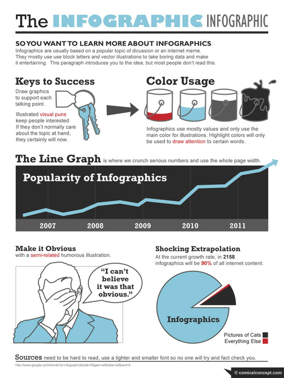
You can also learn some of the basics of infographic design from the infographic below. Man! How many times can you use the word infographic in a sentence?

5. Add an embed code to let others re-post it
Okay, now really pay attention: If you want your infographic post to spread, you need to let people know it’s okay to do so. Copyblogger wrote a good post about attribution for infographics (and giving credit where credit is due). What you want to do is let people know (and feel comfortable) that they can re-purpose your content on their own blog. the best way is to include embed code beneath the infographic that lets someone drop a simple block of ready-made Javascript onto their blog.
The code should be set up to show the infographic from your server and have a link beneath attributing it to you with a link back to your original post.
Here’s an example:
You can embed this infographic on your blog
Notice how it links back to the original graphic/post and also includes a byline that includes a link to your website (link building 101). To make it even easier, I included some Javascript to auto-select the code when it’s clicked – to make it easier to copy and paste.
SEOmoz had an interesting post that shows a widget that creates the embed code for you.
6. Making your Infographic go Viral
A post I found makes a few good points about making your infographic go viral.
One of the things I liked was the list of directories that you can use to extend the reach of your work of art (or hideous attack on the senses). Adding Pinterest to the list too as it wasn’t on the original and should be. You’ll see a few of these later as you can use them both as a resource for finding ones to borrow, and also as places to house your own work.
- Visual.ly
- Daily Infographic
- Cool Infographics
- Infographics Archive
- Infographic Journal
- Infographics Showcase
- Visual Loop
- Flickr
- Pinterest – Infographic from Dan Zarella on How to get More Pins and Re-Pins on Pinterest
Another good takeaway is having a plan – it’s really important with social media to have a well laid out plan, so that you can coordinate between different networks at optimum times. There are better times to tweet, and to get more clicks on Twitter, your target market might be on the other side of the world, yada yada. You get it.
Schedule your promotional activities around your potential (or existing) customers and the times when they are more likely to engage. Read The science of social timing – and yes, it’s an infographic.
Building the mechanics for virality
Finally, if you really want to make something go viral – make it EPIC! Then wrap it up with a blog post in a PDF and put together a landing page to offer it up in exchange for a tweet. This case study on “How I Created a Viral Ebook Landing Page – Using ThemeForest, PayWithATweet, KISSinsights and Unbounce” explains the entire process.
7. Using Your network
After spending a lot of money or time to create your masterpiece, now is the time to call in favors and mobilize your network. How? email all the big hitters in your email list and ask them for a favor.
This is how I would ask for a favor
Subject: “[Quick Favor] Could you share this post re: xxxxxxxx for me?”
Then provide them with a brief explanation as to what it is you would like them to share, and provide some tweetables (discussed later) ready and waiting for them so you’re not wasting their time (we’re all busy).
Tip: Remember to add that they can always hit you back up for the same, where you’ll share for them when they need it (they’ll appreciate it and it’s only fair). This helps foster relationships and build a stronger social network with your influencers.
Using other people’s infographics
People want backlinks – that’s why they create infographics in the first place. So this method of marketing serves two purposes; It gives you a content base to build a post from (awesome, quick and easy) and it gives some love back to the creator of the original work. #WinWin.
8. Finding Infographics
If you’re going to follow the route of using other’s work with your annotated opinion (curation basically) – then here are a bunch of great places to find inspiration:
Sharing the love: Don’t forget to tweet at the person/company you borrow content from and link to them in your post as a thank you.
How to Use Them
Most infographics have an embed code to encourage others to use them on their blogs. So grab these and add them to a post. You can still make successful content by utilizing someone else’s content as your base – just make sure that you add new value to it to make it even more useful.
Extrapolating some information to re-write as text is important to extend the original thought of the graphic (build on the ideas of others – #ThanksIdeo) – which also helps SEO as you’ll have text in your post, this way you’re creating new content – from someone else’s idea. Think of it like a remix.
There are two main ways to add value to someone else’s infographic – Have a great intro and add tweetable facts at the end of the post.
9. Adding value
Remember, it’s not just about the infographic. You still need to capture peoples attention to the extent where they’ll understand what it’s about and why you are blogging about it.
I find it effective to pick a choice nugget of wisdom from the infographic and kick things off with a deeper explanation to pique the readers curiosity. As an example, I recently shared an infographic checklist (who doesn’t like a checklist? #ShopMuch), that built on the essence of what was a very high level graphic by adding some opinion and substance.
Note how there is a general ‘Pin It’ (Pinterest) button at the top-left that will pin the first image automatically – but that I also included manually created separate Pin It buttons for the infographic which almost doubled the sharing on that network. We’ll talk more about Pinterest later.
Reminder: How to Add Value
- Adding some original thought
- Spark conversation by either critiquing it or using it as inspiration for another discussion – Eric Wittlake does this well in The Most Dangerous Opinion in Marketing: Yours
- Include others: Do a round-up of infographics on a given subject
10. What’s the proper etiquette for re-using others work?
BIG point here. If you’re going to use the content of others you need to remember to do all of these things:
- Ensure you link the graphic back to their original post – a simple courtesy but also gives your readers the option to see a bigger version
- Thank them on Twitter (and other networks when you spread the word)
- Include a text link (with nice anchor text for SEO love) below the image to the original post or their homepage – although their embed code may already include this – add it if it doesn’t
Things You Should Do For all Infographics
Regardless of whether you designed your own infographic or sourced one from elsewhere, there are certain things you should always do to ensure they get the attention they deserve. Here are some examples:
11. Add Pin It buttons

If you have great imagery in your posts, then you need to let people share your imagery there. I’ll keep this dead simple, here is a list of things you should do:
Important Note
If you Pinterest Pin It buttons cause Outlook to crash or freeze, so wait until your RSS email subscribers get the post delivered to their inbox (in Feedburner for example you have a 2hr time slot set) – and then ad the Pin It buttons after that.
- Go to http://pinterest.com/about/goodies/, scroll to the bottom and manually create Pin It buttons and place them above and below the great infographics in your post (you will have seen examples above).
- Make the pin’s description text as CTA’ish as possible and include a shortened link to your post – The pin itself will already be linked, but this adds a little extra persuasive element for people to share and click.
- If you use a Pinterest plugin (like the one top-left on this post) – note that it will only pin the first image it finds on the page, so get used to adding strong imagery to the top of every post for a higher likelihood of it being pinned.
- For maximum pinnability, you’ll want to make your images as interesting/unusual/original/funny as possible. Consider adding a caption directly on the image to make people want to share/remember it.
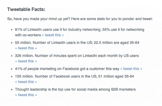
12. Tweetables: Set up important and entertaining stats formatted as Tweets

One of the most important things you can do to increase the reach of your post is to extract the most meaningful, quotable or funny quotes from the graphic and add them as Twitter-ready text descriptions below the post. Each should be accompanied by a » Tweet This « CTA to make it really easy to share the information. For a great example, check out this post (and scroll to below the infographic for examples) – Facebook vs. LinkedIn – 10 B2B Marketing Resources [with Infographic].
This really encourages people to retweet your content in a more original and interesting way – they also get a whole set of tweets to pick from which stops them having to think (tapping side of my head – #smrt).
How? Use clicktotweet.com to create the tweetables. Easy peasy.
How to do it Right
This isn’t a guarantee, but try to find the very best tweetable fact and add it to the top of your list. Recently, we found a really funny one in an infographic we used that was really successful as a tweetable fact.
People are more likely to survive a plane crash than click a banner ad
[ tweet this ]
Irresistable…
If you have created any original infographic posts – share them in the comments below. If they have tweetables, you just might find us sharing them :)
Download the 12-step guide as a PDF
If you like it, please share on Twitter of Facebook as a thank you – hope you enjoy.
The Ultimate Guide to Marketing with Infographics (pdf)
Written by — Oli Gardner and very well edited by Georgiana Laudi


