When Maverick was busy shooting down MiGs, Goose was watching his tail.
When Han Solo was cornered by storm troopers, Chewbacca was there to bail him out.
And when a high percentage of visitors abandon your landing page, you need a trusty sidekick to swoop in and make your offer more persuasive.
So what’s the perfect sidekick? How about an exit popup to sweeten the pot for users who are about to abandon your page?
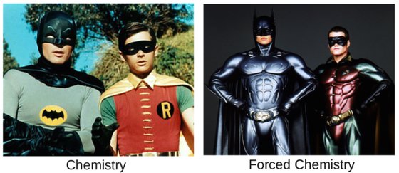
Though the use of exit popups is a controversial subject, they can be extremely effective when used strategically. When done right, they’re the perfect landing page sidekick; the Robin to your Batman, the McMahon to your Carson.
But like any good duo, there must be chemistry or it just won’t work. And chemistry can’t be forced (*cough* Clooney and O’Donnell *cough*).
So how can you partner your landing page with an optimized exit popup that captures conversions that you would have otherwise lost?
Here are three companies that are successfully capturing more conversions with an exit popup – plus advice on how you can couple your landing page with an exit popup to make your offer more persuasive.
How to use exit popup to escalate urgency
YourMechanic, a mobile repair service, positions itself as a convenient, time-efficient alternative to visiting a traditional repair shop.
The YourMechanic marketing team drives traffic to their landing page with a series of PPC campaigns, and has seen lots of success from their exit popup – converting 7.16% of otherwise abandoning users and resulting in hundreds of new customers.
But what makes their exit popup so successful?
It all begins on their landing page:
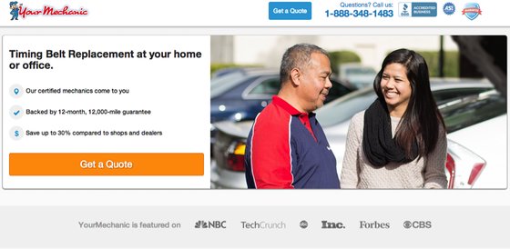
YourMechanic creates a landing page backed up by several elements of social proof – and a very mild dose of urgency is established with the CTA, “Get a Quote.”
But for users who are about to abandon the page, YourMechanic takes things to the next level with an exit popup.
How YourMechanic uses exit popups to escalate urgency
For users ready to abandon the page, YourMechanic uses an exit popup to step up the urgency:
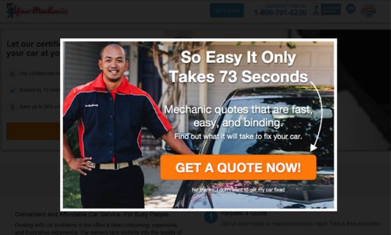
A time-specific headline is used, and the CTA becomes “Get a Quote Now!”
This heightened level of urgency makes the offer a little more compelling by telling users just how quickly they can get a quote.
Further, a directional cue connecting the headline and CTA adds clarity to what the user is being asked to do. They use an arrow, but as Oli mentions in his guide, you can get creative with directional cues and try things such “the suggestive power of the eye.”
Or better yet…

With any directional cue, you want your conversion target to be where design pathways (such as arrows) are leading to, or where people (or animals) are looking or pointing towards.
Action item:
An exit popup is like a second page view served only to abandoning users – try using it to amp up the urgency and entice visitors to make a last-second purchase or opt-in.
Urgency is often conveyed through copy, as per the example above, but another tactic is to use a timer or countdown on your popup to show that the offer is only available for a limited time.
How to use exit popup to counter objections
Amen Clinics provides brain SPECT (single photon emission computed tomography) analysis to diagnose and treat disorders including ADHD, behavioural problems and memory issues.
To promote its services, the clinic runs online campaigns focused on a single disorder, usually featuring videos of founder Dr. Daniel Amen.
This is the landing page for one of their more popular programs, “Healing ADD at Home in 30 Days”:
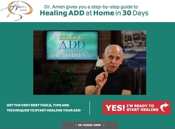
The landing page makes excellent use of many of the techniques that Unbounce co-founder Oli Gardner discusses in his Ultimate Guide to Conversion-Centered Design; they employ a liberal use of contrast and whitespace to ensure that users focus their attention on the desired action: the big red button.
But even with a landing page chock-full of conversion-centered design techniques, Amen Clinics knew their conversion rate had room for improvement.
How Amen Clinics’ uses exit popups to counter potential objections and allow prospects to try before they buy
Amen Clinics’ marketing team hypothesized that although “Healing ADD at Home in 30 days” was a good selling point (and a strong starting point), perhaps some users weren’t yet sure that 1) they had ADD, and 2) the program was right for them.
They decided that an exit popup could be used to address this issue. The exit popup would take a step back, allowing users to self-diagnose and try part of the program before purchasing.
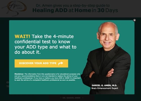
Amen Clinics’ exit popup counters objections and allows people to try the program before they commit.
In exchange for their email address, skeptical visitors could try the program without any commitment and determine whether it was right for them.
The results were impressive; during a 30-day test, 19.44% users who viewed this exit popup were converted from abandoning visitors to highly valuable sales leads.
Action item:
If a high percentage of users are ditching your landing page, an exit popup is fertile ground to test a last-second offer that counters any objections they may have.This could come in the form of a quiz, email course series or a free trial offer that employs the “Try before you buy” principle, where visitors are offered the chance to try the product before purchasing to help determine if they’ve chosen the right solution.
How to use exit popups to provide added value
Yes-Downloads partners with leading software providers to promote PC-based versions of over 50 different games, productivity tools and security programs.
In exchange for the software, Yes-Downloads promotes signups of partner programs – some paid, some freemium.
For their Candy Crush campaign, the marketing team runs high-volume PPC campaigns and uses a combination of attention-driven design principles and an exit popup to secure conversions. Have a look at their campaign page:
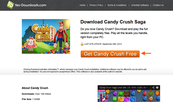
Once more, this page makes excellent use of whitespace and contrast – and a strong directional cue near the CTA. In his guide, Oli calls this type of arrow “about as subtle as a punch of the face,” and I agree – but that’s why they work.
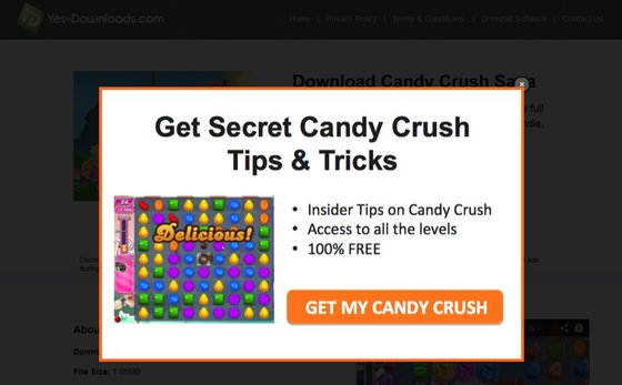
Once their page was optimized with attention-driven design techniques, Yes-Downloads turned to an exit popup to further increase their conversions.
How Yes-Downloads uses exit popups to sweeten the pot
To reduce the number of abandoning visitors on the page, the marketing team added an exit popup that used the same attention-driven design principles as the landing page – but sweetened the pot with a package of additional resources to help users master the game:
To validate their assumptions, they ran an A/B test with an exit popup on the test variant. The results were pretty staggering:
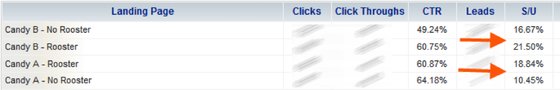
Over a 45-day test, the variant with the exit popup saw a phenomenal 80.28% lift in conversions.
Action item:
Use an exit popup to offer more. Are there other incentives you can include to sweeten the pot and encourage prospects to convert?
Does your landing page have a trusty sidekick?
In essence, an exit popup creates a second pageview for your site; when it activates, it should be:
- Consistent with your landing page offer, but a little sweeter
- Consistent with your landing page design, but simpler
- Consistent with the persuasive tone of your landing page copy, but with the urgency ratcheted up
To ensure your exit popup achieves all of the above, test using attention-driven design principles such as blank space, contrast, urgency and directional cues.
When done effectively, an exit popup will help make your landing page offer more persuasive and can help recover users before they abandon your page – just like a trusty sidekick should.
Listen to Angus on the Call to Action podcast: