
If you spend 15 hours creating your landing page and three minutes on your call-to-action (CTA) button, you’re making a huge mistake. Every part of your landing page impacts your conversion rate, including that lil’ clickable zone.
As it turns out, there are plenty of variables going into your CTA button and its ability to convert visitors. You’ve gotta combine the right copy, location, and design to optimize your results. A successful CTA button takes some TLC.
This article will teach you how to give your CTA buttons the oomph they need to put the icing on your conversion cake. Find out what a CTA is and how you can supercharge it with a well-crafted button.
WTH is a CTA?
A CTA is a short phrase that leads visitors to the action you want them to take. It’s a critical part of every landing page strategy.
Think of it as your grand finale—it’s the last text your visitor will read before they decide to convert. So, you want it to lay a clear path to your conversion goal.
Most CTAs come in the form of a clickable button because it draws attention and asks for a simple action from the visitor. By mastering the techniques behind a compelling CTA button, you’ll get even more from your landing page.
The Big Three Elements of a CTA Button
Every CTA button has three main elements to optimize:
1. Copy
You’ll see many marketers throw some popular phrases on their CTA buttons and call it a day. Think “Sign up,” “Try now,” or “Get started.” They get the job done, but they don’t optimize the CTA to its fullest.
To get the best results from your CTA button’s copy, you need to consider your CTA as a call to value. Explain how clicking the button will change your visitor’s world.
As Ross Simmonds demonstrates, you can turn a generic phrase like “Get started” into a customer-focused saying like “Plan your finances” or “Grow your following.” These phrases directly connect clicking the button with the main benefit the conversion provides.
First-person language is another tactic that encourages visitors to convert. When ContentVerve rephrased a CTA to say “Start my free 30-day trial” instead of “Start your 30-day free trial,” they saw a 90% boost in their click-through rate. Another example you could use is “I want it!” instead of a second-person phrase like “Get it here.”
Now, let’s combine the call to value and first-person language tactics. Here’s what they look like in action on a landing page for Firstleaf:
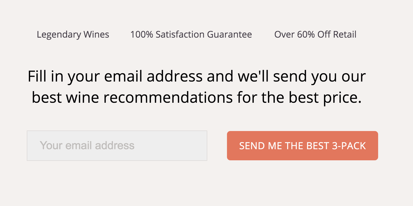
The phrase “Send me the best 3-pack” gives the visitor a feeling of control over their conversion. While many CTA buttons give the visitor a command (e.g., “Order a 3-pack”), Firstleaf’s button lets the visitor ask instead. This button also emphasizes that the visitor will get the best 3-pack, not your run-of-the-mill 3-pack.
As you put these tactics into action, remember that your landing page audiences fall in different stages of the conversion funnel. For example, if you have a landing page encouraging top-of-the-funnel customers to sign up for emails, you don’t want to be selling the value of your product yet. Show your visitors the value they’ll get for taking action at the stage of the funnel they’re currently in.
2. Location
Your CTA won’t get you the results you want if it’s not in a place where it’ll make an impact. At best, it will lead to fewer conversions, and at worst, folks won’t be able to find it in the first place.
When you think about where to place your CTA button, size doesn’t always matter as much as noticeability. A huge button won’t make a difference if it’s jumbled in a bunch of other elements.
You see, your CTA button should follow the natural visual hierarchy our brains use to process online content. Your most important landing page elements should fall in a Z or F pattern and visually “pop” through size, color, or contrast.
Of course, your button’s position on your landing page content will also play a role in its effect on conversions. Consider placing your button “above the fold” or at the top of the page before visitors start scrolling. If you’d rather pitch your landing page subject first, you could also try putting it at the end as the “conclusion” to your content.
Heck, you could take a page outta Indochino’s book and place your CTA button in more than one spot. They put their CTA on the top, middle, and bottom sections of this landing page:
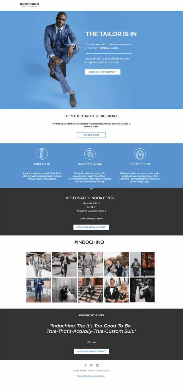
As you can see, the first CTA is more urgent than the two that follow it. The text leading up to that CTA mentions a drawing for customers who book an appointment by a certain date.
If you use multiple CTA locations, try designating one as your main CTA and let the others catch any stragglers.
You can also put your CTA button front and center with a sticky bar or popup. These features broadcast your CTA loud and clear at the top of your page or on top of it. Unbounce has tons of templates for sticky bars and popups that you can try adding to your landing page.
3. Design
You didn’t think we were gonna overlook your CTA button’s design, did you?
Its shape, size, color, and other visual elements influence its role in your landing page’s conversion potential.
Let’s talk about color first. Color affects your landing page elements’ success in two ways: through readability and psychological color associations.
In other words, you want to keep your button colors contrasting but complementary and use colors associated with the emotions you want your visitors to feel. Your choice of color should work with the rest of the colors on your landing page while keeping your button distinct from everything else. The Unbounce guide to conversion-centered design recommends assigning a specific color that you only use for CTAs.
A properly sized CTA button will be big enough for visitors to easily find it, but not so big that it ruins the layout around it, as UX Planet puts it. They also point out that mobile landing pages have specific size standards. While Apple recommends keeping your CTA buttons at least 44×44 pixels big, Microsoft suggests 34×26 pixels.
The design surrounding your button matters, too. If you placed your CTA button on a hero image, make sure the image directs your eye to the button, as suggested by Neil Patel. For example, you could use an image of a person to appear to be looking at the button.
Wanna see how design can make a button truly pop? SnackNation’s got you covered:

They use an orange button on a purple background—a color combination that sounds like it shouldn’t work yet nails it.
Why? If you look at a color wheel, you’ll see orange and purple across from each other, meaning they’re complimentary colors that contrast well. Plus, check out the orange confetti in the hero image that pulls the whole color scheme together.
If you have a hard time making a button design that feels right, try using a landing page template. Since professionals design them, their CTA buttons will already have optimized designs. For example, Unbounce’s Simple template uses a red button that draws your eye without clashing with the rest of the page.
Always Use CTA Buttons That Work for Your Audience
Whichever of this article’s best practices you try for your CTA buttons, always remember that your audience’s preferences come first. Personalized CTAs have a 202% better conversion rate than basic ones. Use your data on your high-performing CTA buttons to guide your future decisions.
Since every audience has unique preferences, try using a tool like Smart Traffic that helps you direct different folks to different landing page variants. You could create a few variants with different button designs, then let Smart Traffic direct visitors to the variant most likely to convert them.

