That’s where insurance landing pages come in.
In this guide, we’ll explore everything you need to know about insurance landing pages, including:
- Use cases and ideas for building your own
- Key features your insurance landing pages should include
- Insurance landing page examples to inspire you
- The best way to get started with building your own landing pages
Let’s get into it!
Why do you need an insurance landing page?
Like we mentioned above, insurance landing pages exist to help get new leads for insurance companies.
And if you’re marketing for an insurance company, then you’re no doubt aware of the role online searches play in a buyer’s journey—69% of all insurance purchases begin with a simple search.
That’s a significant amount of traffic, and being able to capture it is key to any insurance business.
That’s where insurance landing pages come in.
These pages have a singular focus: driving business. They let marketers tailor their messages and offers to reach their audience directly and immediately get them into the sales funnel.
And because they’re so customizable and flexible, these landing pages are a great way to not only make your compelling offer but also communicate some of your values around the security, convenience, and peace of mind a customer gets when they convert.
That dual purpose—making an offer while delivering peace of mind—is a major component of any good insurance landing page. Finding the right mix of the two is key to success, but there are other messages marketers can use to stand out.
If you’re able to share an awesome offer, you can lean into the discounts and savings a customer can access through your landing page.
TABLE OF CONTENTS
Josh Gallant
Josh is the founder of Backstage SEO, an organic growth firm that helps SaaS companies capture demand. He’s a self-proclaimed spreadsheet nerd by day, volunteer soccer coach on weekends, and wannabe fantasy football expert every fall.
» More blog posts by
Josh Gallant
What are the key features of a high-converting insurance landing page?
Every good insurance landing page is going to share a few common features, even if their branding and offers differ. Let’s take a look at some of these key features and how they contribute to awesome conversion rates.
Attention-grabbing headlines
The first thing someone will see on your landing page is a headline. That headline should immediately communicate your value proposition and start to highlight the benefits of your insurance products and services. Basically, you’re looking to grab as much attention as possible and give visitors a reason to stick around.
Strong visual design
It’s not all on your headline—a good landing page is a fusion between visuals, copy, layout, and function. Using imagery and visuals strategically can help guide visitors through your content and towards your CTA. You’re also able to use these elements to support your copy and headlines.
Persuasive, informative copy
On the topic of copy, any wording you use on your landing page needs to be concise, clear, and focused on your offer. Using bullet points is a great way to keep landing page copy brief and scannable so anyone can quickly grasp your offer and value proposition, but you can also pair copy with design elements to address potential pain points in greater detail.
And remember, insurance can be a stressful topic. Don’t make outlandish promises or resort to scare tactics—focus instead on peace of mind, protection, and taking a burden off the shoulders of your customers.
If you’re an Unbounce user, you can also tap into the built-in AI copywriting assistant to expand, summarize, remix, or add the next sentence to help you refine your copy right where you’re building it.
Trust signals and social proof
Trust signals are crucial for building credibility. Any relevant accreditations your insurance company holds can (and should) be highlighted on your landing page—think certifications from the Better Business Bureau or industry awards.
But pairing these trust signals with compelling social proof is a winning combo. Testimonials, reviews, and case studies not only highlight what you’re able to do, they turn your customers into your biggest promoters—studies show that three of the top five factors that build trust are reputation, reviews, and recommendations.
An optimized call to action (CTA)
We could write whole articles on the power of a great call to action—in fact, we have! You want your CTA to stand out and draw the eye, which involves finding the right design, the right words, and the right position. It’s equal parts art and science. Remember, you’re trying to create a sense of urgency while outlining exactly what a user will get when they click.
Frictionless forms
No matter your offer, the landing page form you use to gather visitor information should be as minimal as possible—a challenge when you’re trying to get a detailed picture of a customer to tailor insurance to their needs. You need information, but more form fields means greater friction, which means a greater chance visitors will bounce off your page.
The solution? Try the breadcrumb method—spread your form fields out over multiple steps and pages, so users only have to fill out a bit at a time. Alternatively, use your form to capture basic contact information so you can reach out to grab more information at a later date.
The 10 best insurance landing page examples to inspire your next campaign
Now that we’ve covered key features to include in your insurance landing pages, let’s take a closer look at a few examples of landing pages you can use to inspire your own.
We’ve drawn examples from a range of companies, with a focus on everything from life insurance and business insurance to auto insurance and health insurance.
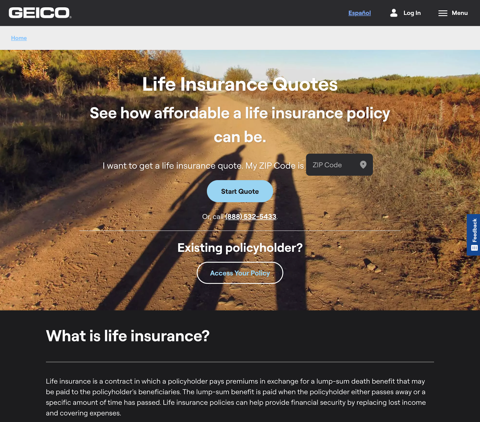
1. GEICO’s life insurance quote landing page
GEICO is a widely known insurance provider that began with a focus on cars and vehicles before expanding their offerings to a range of products and services to meet the needs of their customers. Most people would be familiar with the GEICO gecko in their advertising, but this landing page takes a different angle to focus on life insurance policies.
- Life insurance is a serious topic, and the design of the page reflects this with a warm, family-focused hero image as a background. It quietly reminds us of why we take out life insurance policies without ever overwhelming the visitor.
- There’s a dual CTA here, and the design of the primary CTA (“Start Quote”) makes it stand out appropriately—but they also know that existing policyholders might want to add more coverage. It’s a slick approach!
- Scrolling further down the page lets visitors explore more supporting content, including detailed FAQs and information on specific product types.
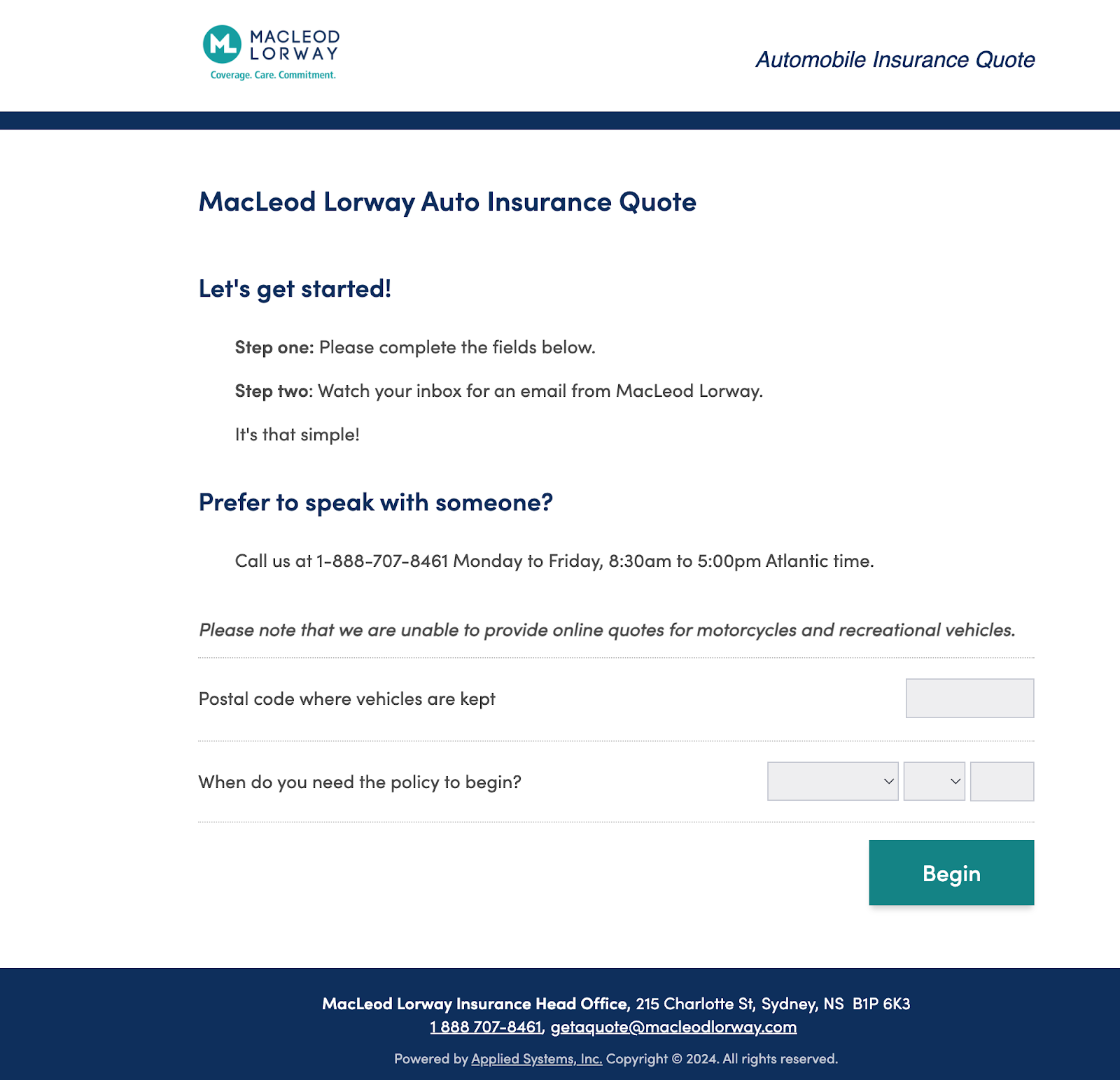
2. MacLeod Lorway’s car insurance quote landing page
MacLeod Lorway is a Canadian insurance broker with an auto insurance quote page that immediately gets users into a breadcrumbed form. It’s a great example of a stage-by-stage approach to gathering necessary insurance information
Image courtesy MacLeod Lorway
- Again, this is a solid example of a form using the breadcrumb technique to reduce friction.
- The design of the page is as clean as it gets, with smart use of negative space to keep your attention focused on the form fields.
- Before you click through to this form, the page uses great visual design to grab attention and guide you to the product you need.
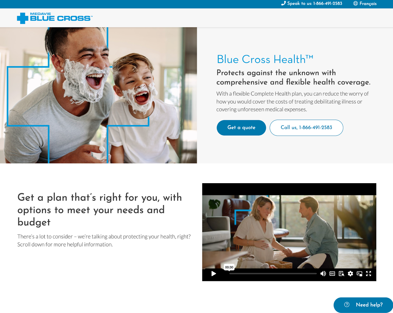
3. Blue Cross Health insurance landing page
Blue Cross Health is a health insurance provider that partners with the Blue Cross Blue Shield Association to deliver affordable, accessible healthcare coverage.
Image courtesy Blue Cross Health
- This health insurance landing page uses strong imagery to help guide the eye towards the CTA—notice how the father’s and son’s eyelines point to “Get a quote”? It’s a great technique that marries visual elements and copy subtly but effectively.
- Including a video on a landing page can be a great way to boost conversion rates, but it only works if it’s a relevant, useful video that supports the rest of the page. Blue Cross Health have positioned theirs so it works as a still image, but adds a bit more interactivity to the page.
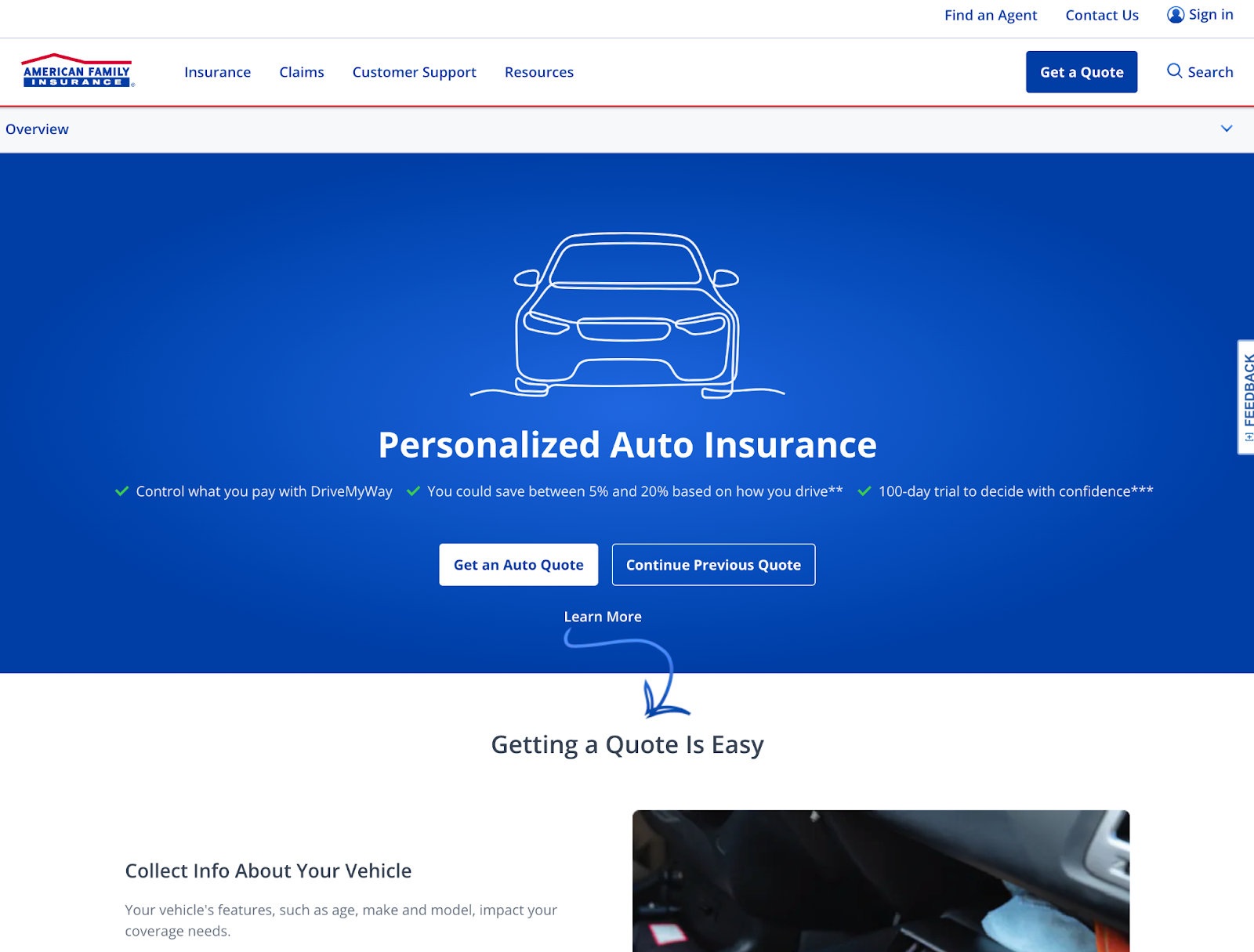
4. American Family Insurance auto insurance landing page
American Family Insurance is an insurance company that prioritizes trust, accountability, and convenience through their products and services. They offer a range of insurance options, including a landing page for auto insurance.
Image courtesy American Family Insurance
- Sometimes less is more, and this page streamlines and simplifies its layout to focus on a simple hero image and a standout CTA. Because our eyes are drawn to white space, the contrast with the blue background makes these above-the-fold elements stand out dramatically.
- Even this simple layout gets some subtle direction into the mix. The arrow element almost looks hand-drawn, a fun touch that keeps users moving through the content if they’re not quite ready to click the CTA right away.
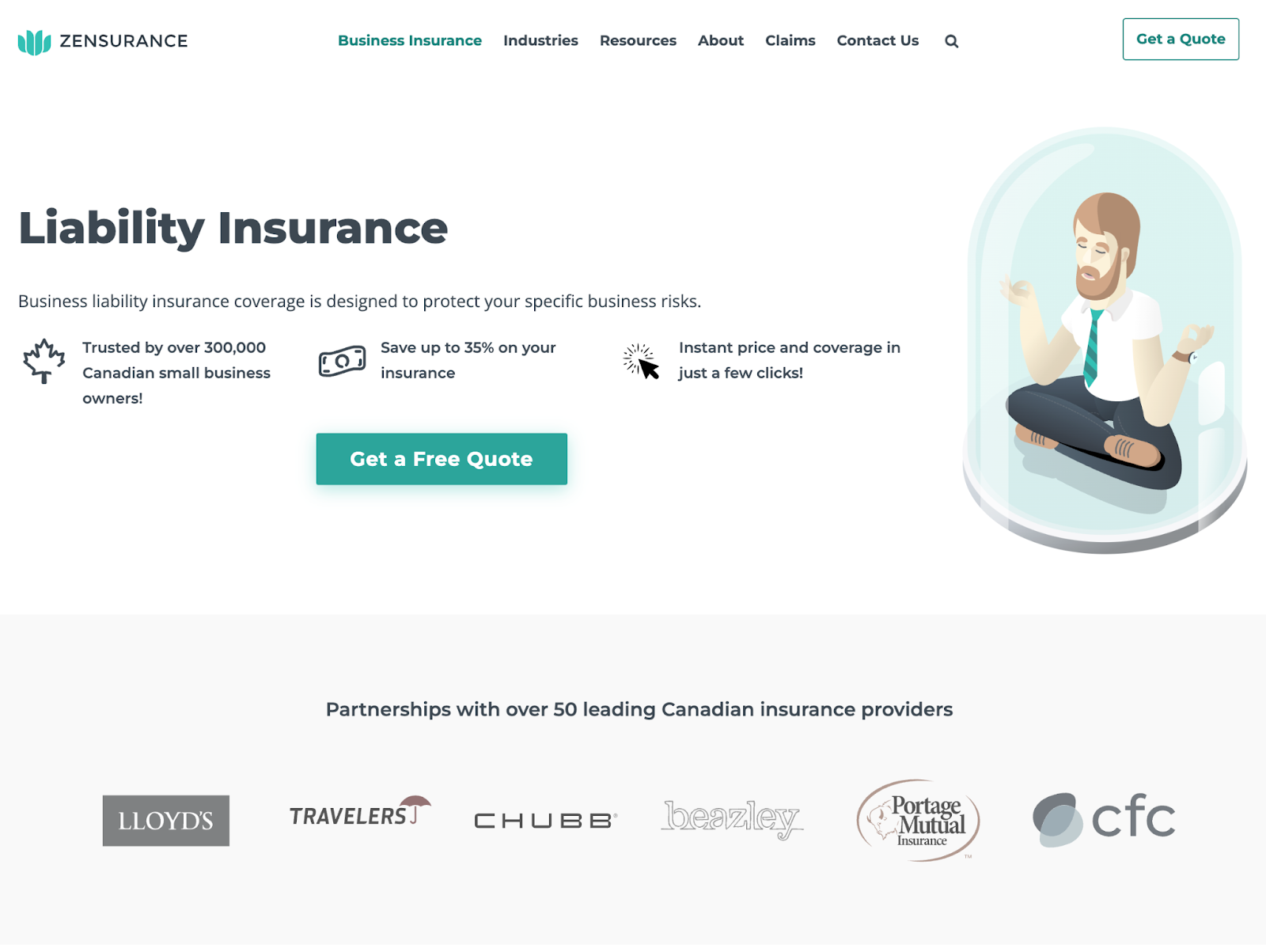
5. Zensurance business liability insurance
Zensurance’s business liability insurance landing page is an amazing example of how to make a strong sales pitch without ever actually making a pitch.
Image courtesy Zensurance
- This is an incredible use of trust signals. The icon items above the fold are punchy and focus on Zensurance’s past success, and they get a follow-up with the logos of partners they work with.
- Zensurance pairs these trust signals with a wealth of testimonials and reviews further down the page, a great way to support the marketing claims they make through their content.
- Their promise of saving up to 35% on insurance products is a very enticing offer and an effective way to encourage users to click.
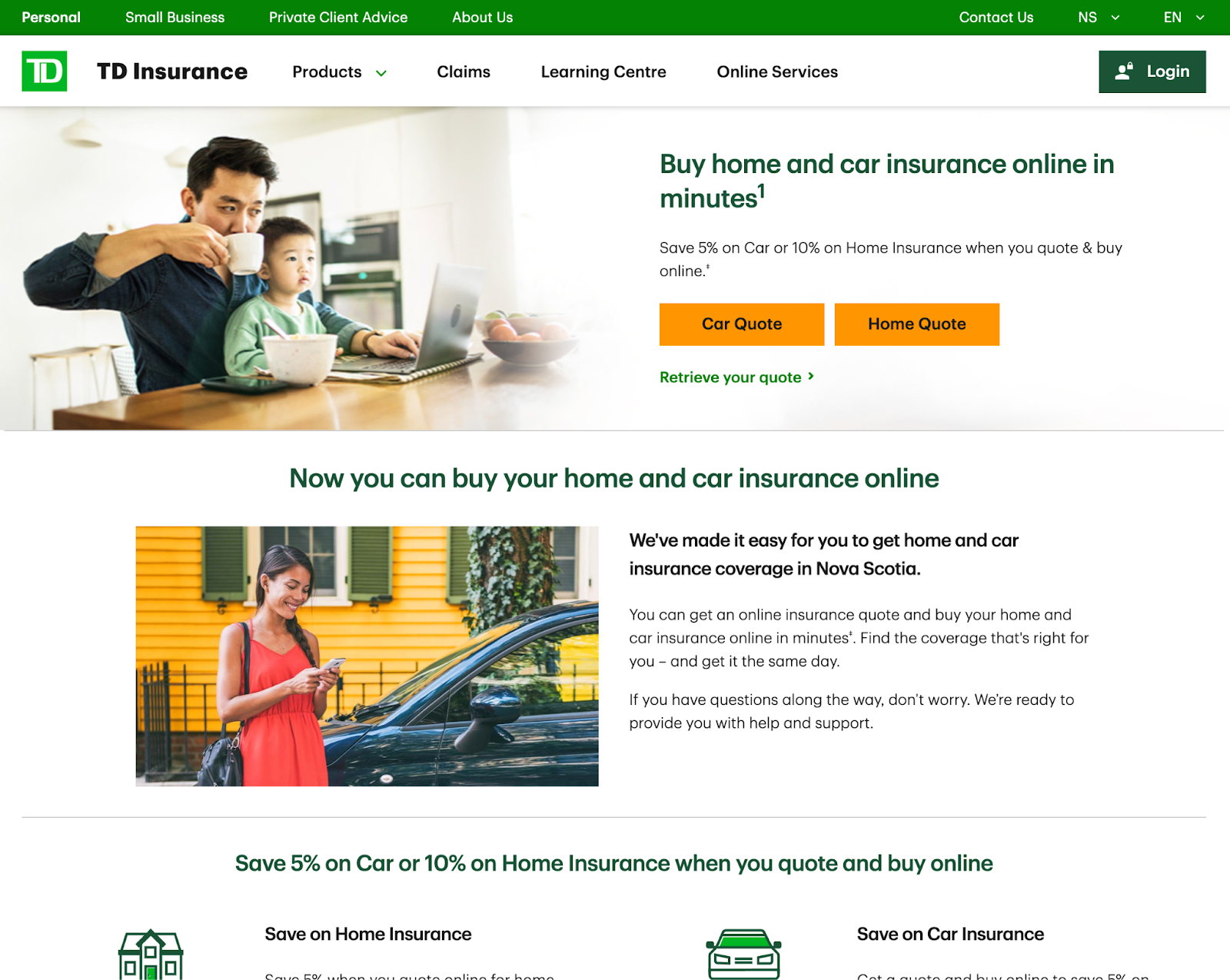
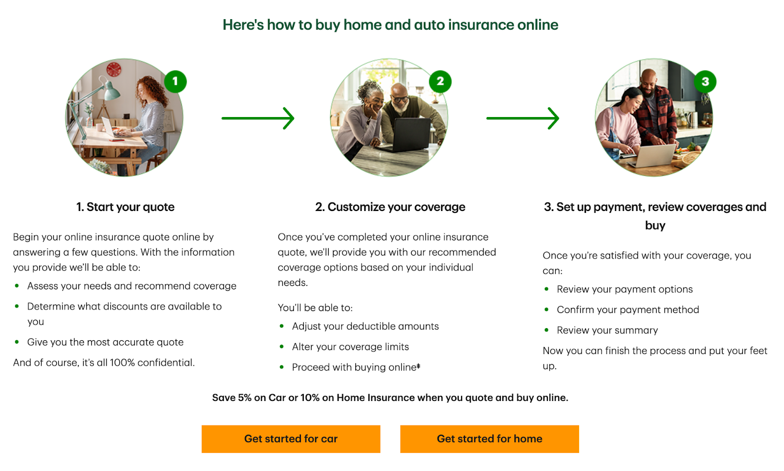
6. TD Insurance bundled insurance landing page
TD Insurance’s landing page helps funnel visitors to the product they need by letting them choose between car and home quotes and supports it with a compelling offer—all backed by features that nail the fundamentals of good landing page design.
Image courtesy TD Insurance
Image courtesy TD Insurance
- Even with a few options for visitors to choose from, the offer gets a great call-out right below the headline—save when you get a quote and buy online. That’s a compelling reason to click through if there ever was one!
- The step-by-step guide they include further down the page helps set expectations for what the quoting and purchasing process is going to be like, an excellent way to ensure users know exactly what they’re getting.
- The page layout and design nail the basics—every graphical element is carefully chosen to help support the overall page, and the copy is straightforward and to the point. Plus, it’s a clean layout and structure.
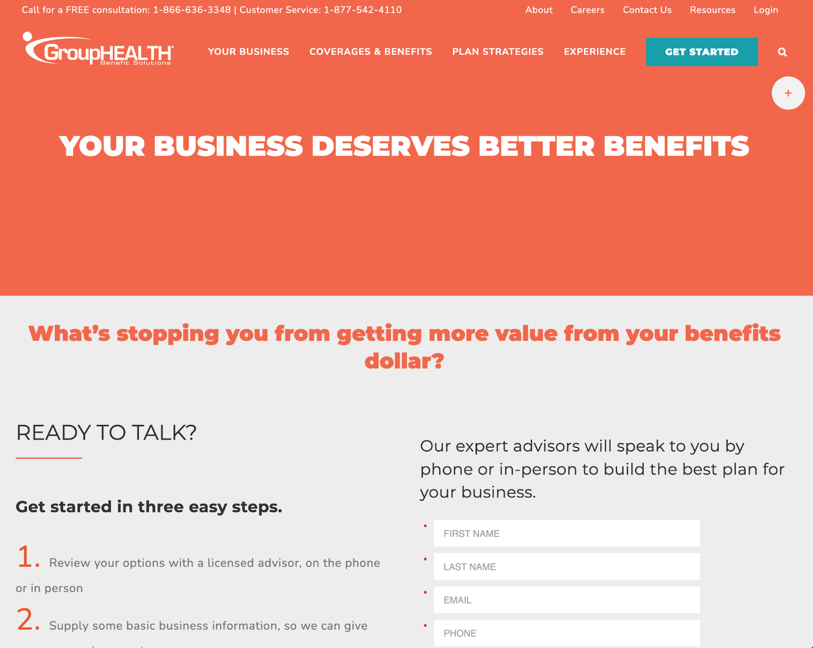
7. GroupHEALTH Benefit Solutions landing page
GroupHEALTH Benefits Solutions delivers health and insurance coverage for businesses, including group benefits for employees.
Image courtesy GroupHEALTH Benefits Solutions
- A strong headline grabs attention, and this one certainly gets attention—who doesn’t want more for their dollar?
- This is a bold page that streamlines its layout to focus almost exclusively on the headline and form. Supporting content is kept to a minimum to encourage visitors to reach out and get started.
- Unlike other insurance landing pages, this one leans heavily on a bolder color choice—it’s a nice touch that helps it stand out, and reflects that the company is trying to help businesses deliver better benefits for their employees.
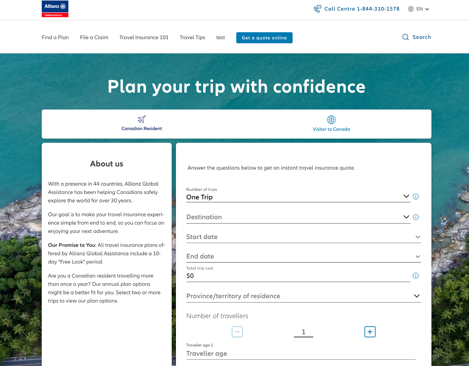
8. Allianz travel insurance landing page
Travel insurance is one of those things most tourists think of as an afterthought, if they think of it at all, but when the worst happens, it’s got your back. Allianz Global Assistance offers travel insurance for voyagers jet-setting around the globe.
Image courtesy Allianz Global Assistance
- You can almost feel the beach and coastline sitting behind the form here, and that’s certainly by design. The imagery is a subtle reminder that you’re getting insurance to make sure you’re protected while you enjoy a stunning vacation.
- The headline is simple and straightforward and focused on a common customer pain point: Vacation planning gets stressful, fast, but Allianz is here to help simplify it.
- The form may have a range of fields, but they’re nonetheless simple and consistent to help capture as much information as possible without overwhelming visitors.
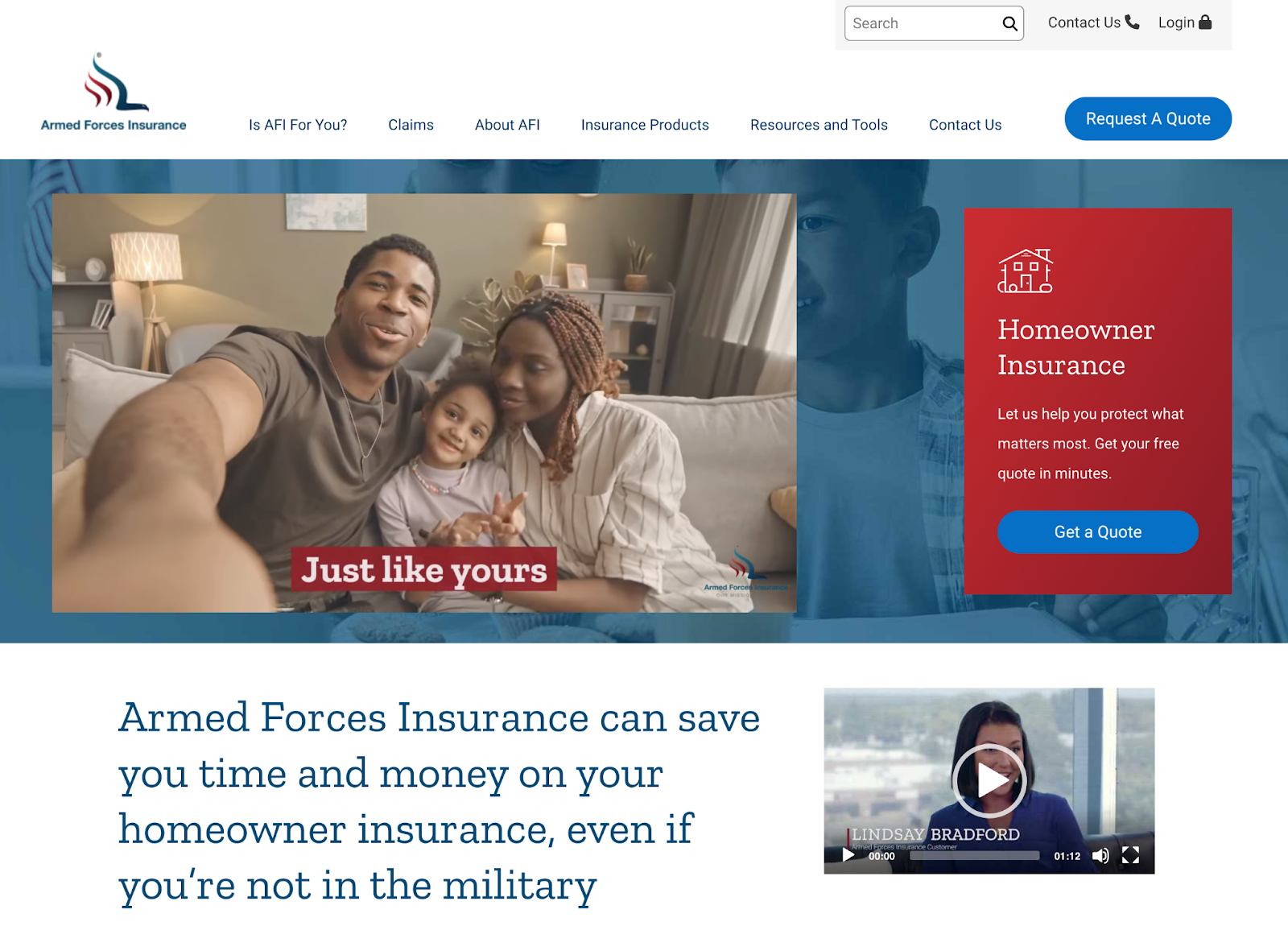
9. Armed Forces Insurance landing page
Armed Forces Insurance specializes in delivering insurance products to members of the United States Armed Forces, who may have specific needs that can’t be met by regular insurance companies due to the nature of their service.
Image courtesy Armed Forces Insurance
- The hero image on this page is actually an autoplaying video that blends seamlessly into the page’s design. This lets them call out a range of pain points or use cases to better speak to their target audience.
- The design of the page leans on familiar iconography and imagery, immediately making it clear this is a page for veterans and active service members.
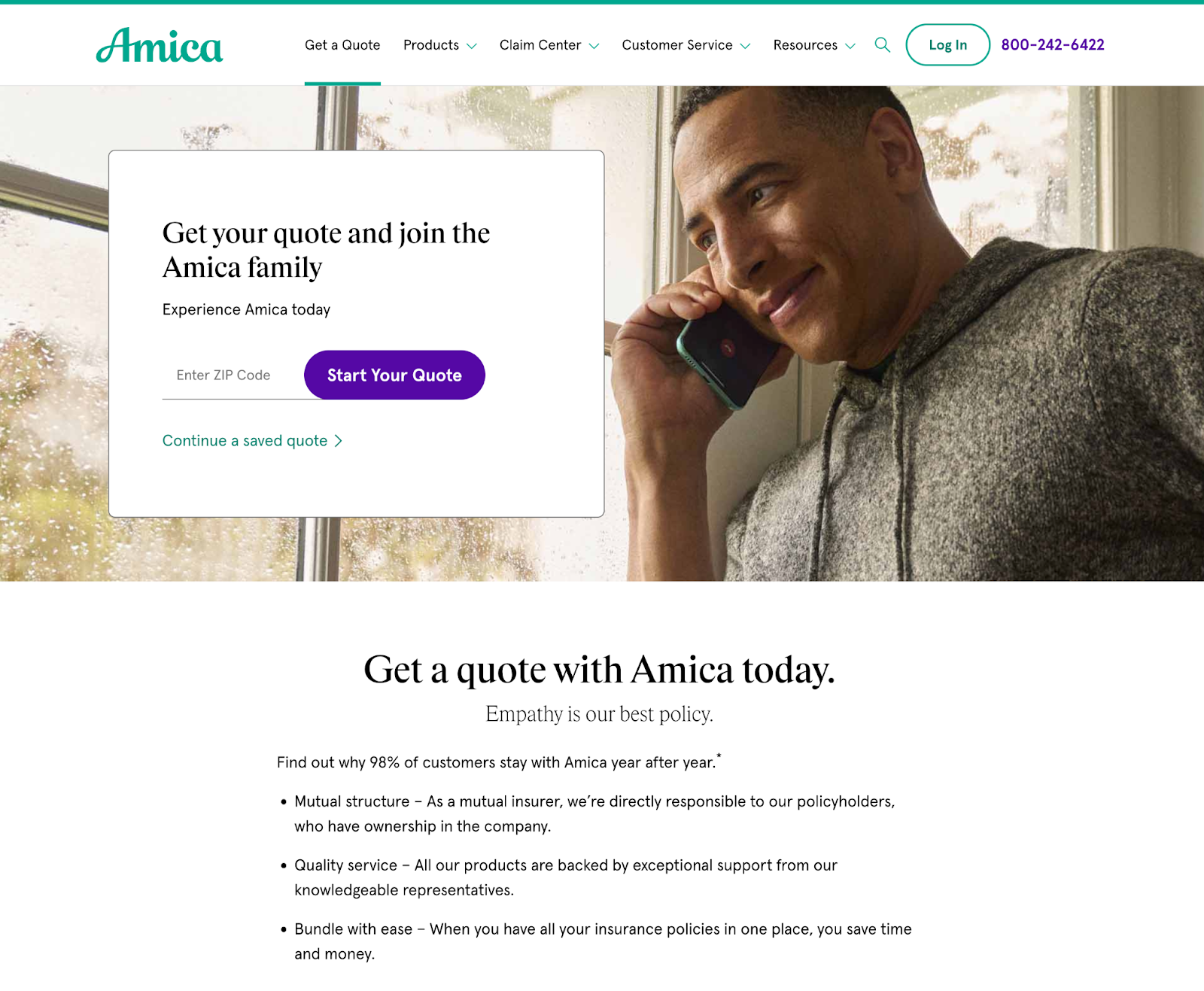
10. Amica insurance quote landing page
Amica’s insurance quote landing page is an all-time great, deploying many of the tactics we’ve discussed so far.
- It’s hard to beat a hero image eyeline—this one matches the headline perfectly, immediately making sure you’re looking at what matters the most.
- Supporting content is concise and kept to a minimum. There’s not much below the fold here, but what you see on the page works extremely well to put readers at ease and really drive home the peace-of-mind message so integral to insurance companies.
Insurance landing page best practices
You’re almost ready to start building your own insurance landing pages, but first, let’s go over some best practices to follow.
- Simplify the CTA for better results: In most cases, your CTA should be some variation of “get a quote.” Keep it simple to keep it effective.
- Use the breadcrumb technique on long forms: Long forms introduce friction, which increases the likelihood a user will bounce. Breadcrumb out your forms to keep users engaged and on-page.
- Create individual pages for individual insurance products: While you can funnel visitors to where they need to be with multiple CTAs or options, it’s much easier to create targeted landing pages for any insurance product you’re trying to sell—and it leads to cleaner analytics data, too.
- Include trust signals and social proof: Let others sing your praises! It goes a long way to boosting your conversion rate.
- Educate your prospects: You don’t want to overload anyone with information, but you want to make sure they understand what they’re getting into. Keep your copy straightforward and only include what’s absolutely necessary for the page.