My commentary on marketing — and the world in general — is very polarized. I despise bad experiences. And I get pretty excited when I see exceptional ones.
Friends who know me well have probably at one time or another experienced OBE (Oli’s Bathroom Experiences).
No, not that kind.
OBE is an ongoing rant about the shitty design of bathroom sinks. Weird thing to get angry about? Perhaps. A reflection of my obsession with designing effective and delightful experiences everywhere? Most definitely.

I’m a bubbly person 99% of the time. But the remaining 1% I can be ever so slightly vicious. And it often comes out when I click on Google Adwords ads and see their corresponding landing pages. And of course during my visits to public restrooms.
With that in mind, I’m going to break down some real-life landing page samples that really caught my attention — for better or for worse.
Speaking of attention, I’ll be referencing my ebook, 23 principles of Attention-Driven Design, throughout, so take heed!
1. MultiTouch
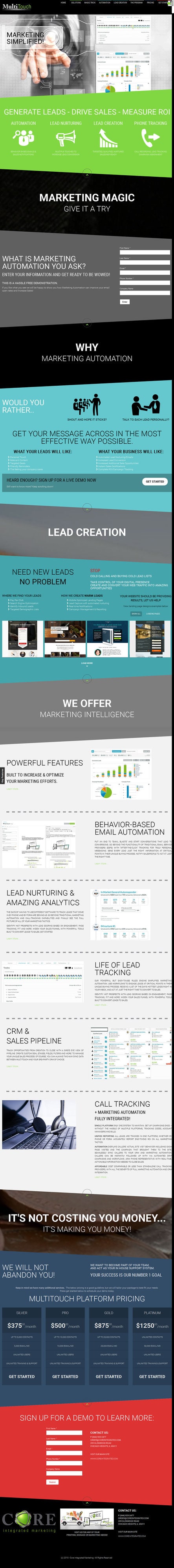
Above-the-fold experience
Firstly, the headline: “Marketing simplified!”. How original. Instead of simplifying marketing, MultiTouch should focus on simplifying its messaging.
Then there’s the hero shot. Let’s see what this businessman in a suit — who’s reenacting Minority Report for us in a way that’s not at all cheesy —has to offer us. Nothing. And the screenshots? They could benefit from some captions, so I know what’s important or different.
Side note: The company is called MultiTouch — emphasis on “multi.” So why is the guy only using one finger? See what I did there?
Let’s explore what the hero shot should be doing, with a definition from the awesome Angie Schottmuller during a recent webinar all about hero shots:
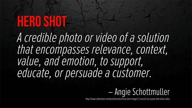
You’ll notice there are seven qualifying qualities of an effective hero shot: relevance, context, value, emotion, support, education and persuasion. How many of those seven things does our generic business dude pull off? None. Zero. Nada. Zip.
So the next time you’re choosing your hero shot, think of an image for each of the seven qualities. That should put you on the path to a visual that has impact, purpose and benefit.
To quote Unbounce’s own Dan Levy: “Next problem please.“
Subhead fail
Onto the subhead: “Generate leads – Drive sales – Measure ROI.”
Like most subheads, this line adds a little more clarity to the context; however, at this point I still don’t know if MultiTouch offers a software product or provides a service. And that’s critical information for the fleeting visitor to your landing page.
Perhaps MultiTouch could qualify the three statements with a unique aspect of its service to add more clarity:
- Generate {higher quality} leads by {unique qualifier}.
- Drive {higher value or more} sales by {unique feature}.
- Measure ROI {across all channels} with our {describe analytics feature}.
Directional cues?
Throughout the page there are these little back-to-the-top links. This is really old-school web design. People already know how to scroll, so don’t worry about helping them get back to the top of the page. Rather, worry about getting visitors back to the CTA.
If you are going to add linked directional cues, make sure they take visitors back to the form.
Call to Action

Yes, I have heard enough — so let’s assume that I have sufficient details to make a buying decision. I’d recommend moving the call to action (CTA) closer to the question, “What is marketing automation you ask?”, using a color with a strong contrast to attract attention (orange would work brilliantly here) and giving it some affordance.
The greater the perceived affordance (the manner in which the design implies how it can be used), the simpler it is to understand the presented interface. In other words, if it looks clickable, it provides a signal to the visitor that it can be used and interacted with.
Here’s a simple diagrammatic exploration of affordance.

One thing to keep in mind, though, is if the button is part of a well designed form (with a container that encapsulates it), affordance is less important, since the form fields imply an interactive element at the end of the form. But when placed in the middle of a page, in the middle of crowded or messy content, strong affordance (coupled with a contrasting color) can help the button stand out and be more of a target of our attention.
Huh?
Next up we have four screenshots of… Unbounce landing page templates. How naughty!

Might have to have a conversation in a dark alley with these folks.

And what else do we have here? Really? Powerful features? Stop telling me that your party is awesome, and just throw an awesome party.
Wait, one more section. Check out this delightful messaging…

“WE WILL NOT ABANDON YOU!” Stop scaring visitors away with desperation!
At this point, I’m kinda lost on how to save this page. It needs to be deleted, and started from scratch. Enough. Undo. 404 or 301 this puppy. I’m abandoning you!
2. Get Response
Above-the-fold experience
Is the fold even a thing anymore?
Regardless of your perspective on this, it’s still nice to see a well architected above-the-fold experience.
I really like the video hero shot here. When designing a video player, there are several characteristics to consider: the container, caption, poster frame (default image seen prior to clicking play) and play button.
- In this case, the container is a fairly standard Apple laptop which conveys the online software aspect.
- Here there is a descriptive caption up top with a nice little directional cue. People are drawn to captions placed in close proximity to images and video, as they lie outside of the container, thus breaking the flow of its perimeter.
- The poster frame showcases an email template and how it would look on a phone, along with a visual of the tool. It is a little busy though, and could benefit from a simpler visual or some callouts pointing to elements.
- The play button would be a little more obvious if it used a stronger contrasting color. It’s a good idea to isolate the CTA by not using its color elsewhere. Here it’s at least reserved primarily for the interactive elements on the page, which is good for consistency.
I would like to see this page with fewer links, thereby focusing visitors’ attention only on watching the video and clicking the call to action. Specifically, let’s have a closer look at the “View Pricing Plans” link under the CTA.
In my experience, links placed beneath the CTA tend to cause a drop in conversions. Here the pricing plans link may be a hindrance, and must be verified through testing.
Beyond the fold
It’s a very long page, and what I like to do with long pages is to look at the scroll map data to see how far people are getting down the page. If they’re not scrolling, I’d be really interested in doing a long page versus short page test here. In fact, I’ve rebuilt this page in Unbounce to show how quickly you can come up with a new variant to test.
I spent a few minutes touching up the finer details (text color and page copy) and you can see the final page here.
3. Ford Employee Pricing
This one came to me as a commercial on the radio while driving the streets of Montreal in a little Car2Go. Employee pricing for everyone — woo-hoo! You pay what we pay. Awesome, right?

What the actual?
Let’s talk about the principle of Distraction for a second. The Attention Ratio on this page is 86:1. And nowhere on the page does it mention employee pricing. It’s making me think of bad sinks again. Ever heard of Message Match? Apparently not.
This is a classic case of selfish marketing: expecting me to hunt around the site to find the offer that was advertised.
Do better, Ford. Do better.
And then something interesting happened when I returned to the site a few hours later.

It seems Ford got its act together a little bit and featured the promo in question. However, it wasn’t there when I (and countless others visited), so it’s still a fail.
There are still a ton of things wrong with the page, but at least Ford’s managed to fix the Message Match problem.
You did slightly better, Ford. You did slightly better. But not when it counted.
4. Zendesk
I love Zendesk as a brand. The team does some exceptional marketing… most of the time. Take a look at the landing page below that was the destination of an AdWords ad. For starters, it’s not a landing page at all — it’s their website. That’s mistake number one. I also want to draw your attention to the order of the copy on the page.

Information Hierarchy
Information Hierarchy is concerned with the order in which the copy on your page is presented — both in literal terms (which comes first) and in terms of the visual dominance (what stands out most).
Here, the primary headline doesn’t tell me anything about the software: “From now on, things will be better.”
Now take a look at the subhead — it contains all of the clarity missing from the headline: “Zendesk is software for better customer service.”
If I’d read the subhead first, I’d immediately know what Zendesk does. I call my solution to this phenomenon The Headline Flip.
Go look at your own landing pages and flip the headline and subhead. Does it add clarity? If so, consider reworking the order or just change the headline entirely to give it more substance.
Then run a five-second test on Usabilityhub.com and ask the question, “What does this product/service do?” to see if you have increased the page’s clarity.
5. KeyShot 5
Remember when I talked about Information Hierarchy? Well, I’m not quite done. Check out the landing page below.
Where’s the logo? Where’s the name of the product? Where’s any form of indication as to what’s going on? I have to get beneath the hero shot and the form before I even get a sense of what I’m looking at.
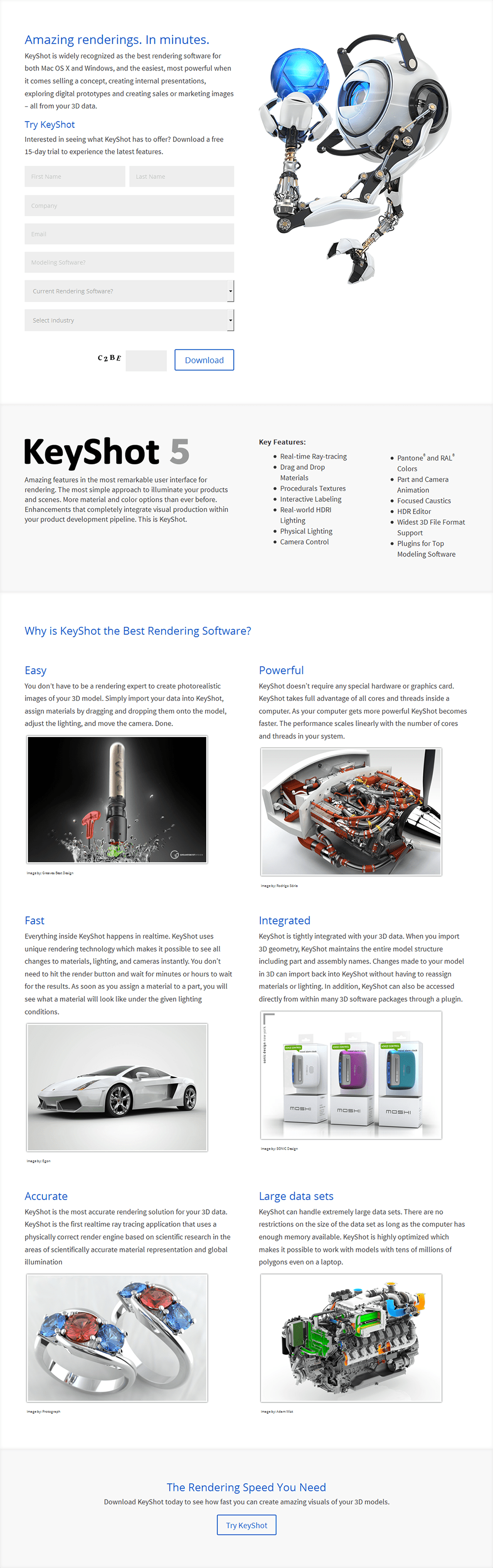
The hero shot is beautiful, but at first glance doesn’t tell me that this page is for rendering software. The keyword I used to get to the page was “animation software,” which provides some context. But still, I wonder if an image or video of the software itself would demonstrate much stronger context of use.
Form(ula)
The form doesn’t do much to clarify the offer, either. Form-first design is when you design your form as if it’s the only thing on the page, allowing it to communicate exactly what will happen when you interact with it.
Here the CTA says “Download,” but it could be way more specific. Rewording the CTA to say, “Download 15-Day Free Trial,” for example, would again help qualify the product as digital software.
Still on the topic of the form: inline field labels suck! They’re a usability – and hence conversion – nightmare.
The reason being that once you click in the field or start typing, the label disappears. You might think this isn’t a big deal, and that people will remember what the label said. Not true. People forget, then they click outside the form so the label shows up again before repeating the exercise.
This is especially problematic on mobile since you often can’t find any space outside the form to click to reset the label. You can click another field, but then you might want to fill in that one — but wait, you can’t see the label.
I will, however, give KeyShot bonus points for using field labels that stay in place when you click the field — disappearing only when you start typing. This is not a bad experience for the most part. And on mobile, there’s a good amount of whitespace around the form to allow scrolling past the form if you want to keep exploring. Now, with all that said, there are a few exceptions to avoiding inline field labels:
- When there’s only one field, because it’s easy enough to remember that you just need to type in your email address
- When the label remains static but faded in the background, instead of disappearing when typing commences
Cognitive overloading
Cognitive load describes the build-up of mental fatigue when going through a bad experience. Each complex or confusing aspect of the page adds to this load and impedes our decision-making ability, and ultimately the desire to continue.
With this in mind, let’s take a look at the fifth form field. The label is a non-question that’s formulated as a question. “Modeling software?” WTF? Are you asking me whether I think this is modeling software? If you recall my initial reaction above, I didn’t know that the page was for modeling software. This is a stress point, guaranteed to make someone stop and think.
Finally, at the end is a captcha — those evil little buggers that ask you to interpret the squiggly words and type them into a box. If you’re going to include a captcha, at least add some instruction so visitors know what to do.
Subhead woes

Further down the page, take a look at the subheads. This is a classic example of “Yay Business” copywriting.
Read them out loud: Easy! Powerful! Fast! Integrated! Accurate! Large data sets!
Gross.
Subheads should convey benefits, which KeyShot hasn’t done. Adding qualifiers to each subhead would add significant value. But that’s enough for this page.
6. RoomKey
Assumptions
A big reason for a lack of clarity on landing pages is assuming your visitors understand your acronyms and jargon. In this case, it’s PMS, which obviously has a more widely understood meaning.
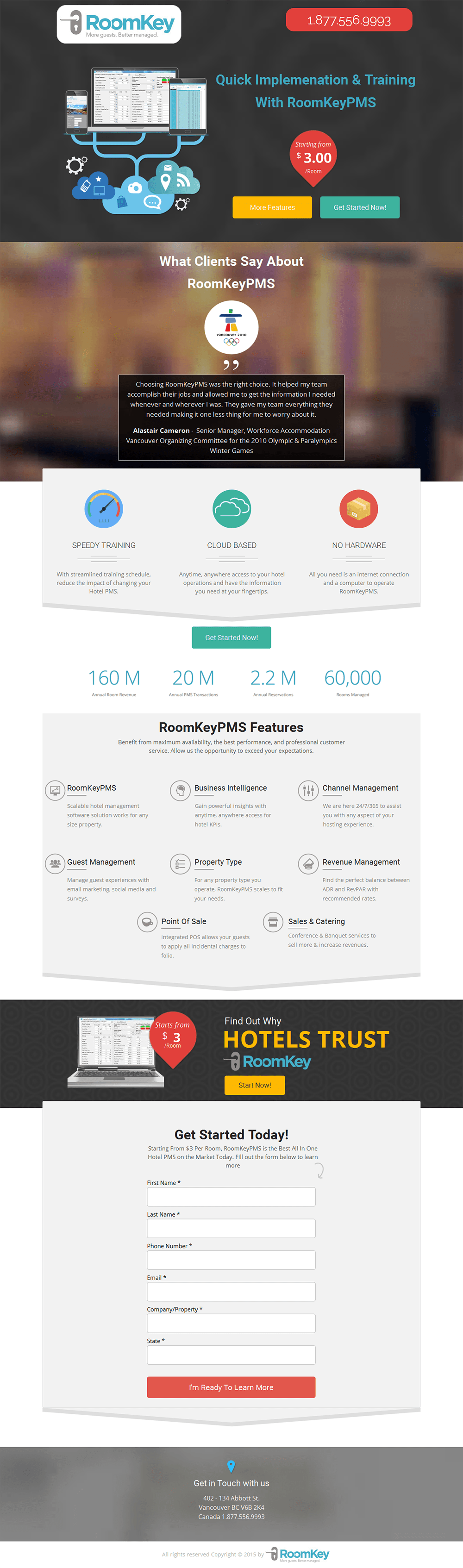
Perhaps the target market is 100% familiar with the term, but I’d be making an assumption, too, if I thought that.
Check out the headline: “Quick implementation {of what} & training {in what} with RoomKeyPMS”.
When you look at it like that, you can see there are holes in the headline and its ability to clearly state the page’s purpose.
I’m really struggling to see what the hero shot is trying to convey here, too, apart from the weird cloud computing reference.
To better showcase the app, I’d suggest using a video or an animated GIF — a popular design trend sweeping through the landing page world — or a simple screen capture video set to autoplay. It quickly demonstrates aspects of the interface in a more compelling way, and allows you to showcase an important feature. Check out the short Wistia video we use on the Unbounce homepage (below the image of the dude).
Scannable testimonials
It’s dangerous (not shark-infested-custard dangerous, but still) to assume that people will read your entire page, but if you have good social proof, you want to encourage people to read it.
A rule I like to go by for any big block of text is that if you can’t find an excellent sentence or phrase to highlight, then you have shitty copy.
For a testimonial, you want to break up the text with a bolded statement, and, similarly, if you can’t find one that’s compelling, your testimonial isn’t going to do its job. Try to find that gold nugget that explains the pain relief, benefit or game/life changer and bold it to break up the text.
In this case the testimonial is generic business rhetoric that has almost zero worth. I’d source another, or reach out to the customer again to uncover that gold.
7. Qlik
I really like the value proposition here, primarily because business analytics is a complex and frustrating realm. Qlik claims the software is simple and intuitive — let’s see if we can say the same for the landing page.
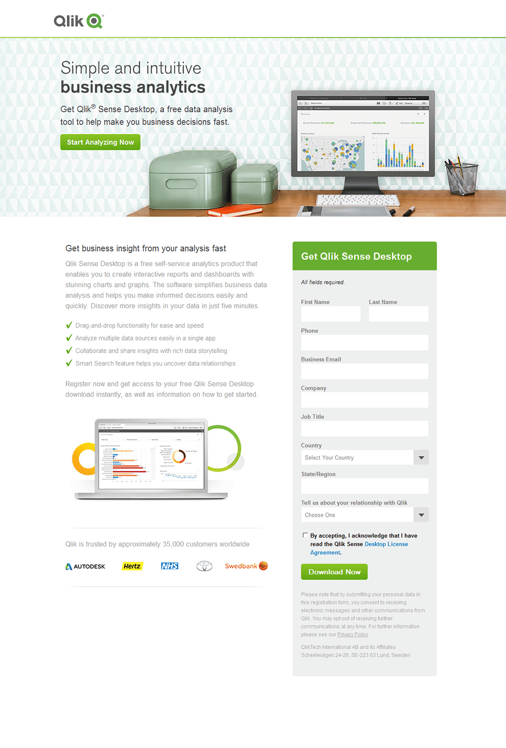
Overall, I’m a fan of the design, but I can’t help feel that the most important part of the hero shot (the screenshot of the software) has been relegated to being secondary. The two tins are so big — for no rational reason — that the screenshot is too small to read. I’d suggest bumping the size of the hero shot by about 50% and making the surrounding elements smaller.
The most benefit-laden sentence in the opening paragraph is, “Discover more insights from your data in just five minutes.” I’d recommend bolding this and putting it on a line of its own to make sure people see it. It might even make sense to put it in the headline/subhead, or as a caption to the hero shot. Doing so connects the software directly to it’s benefit.
Also, in one of the bullets “analyzing multiple data sources” is referenced — some specificity would be good here. What kinds of sources can I integrate with the software? Will it pull from Google Analytics, AdWords?

For the form, I notice a wasted opportunity to include an important subhead that highlights another strong benefit, in case the visitor’s gaze is drawn immediately to the form area, like the example opposite.
8. Adobe
Seriously? You want me to read all of that copy? It looks like a legal document.

The design of a landing page will often affect how people perceive the content that’s being given away. If this datasheet is anything like the landing page, it’ll be dull as sh*t.
The only time you’re told what you’re going to get by interacting with this page is that small bold line of copy at the bottom of the left column. It’s a datasheet. What’s a datasheet? Is it industry data? Is it just a list of technical specs about the software?
Give me some bullets that tell me what I’ll learn and why I should care. Add some bolding to the large paragraphs of text, and maybe give me a preview of what’s in the datasheet: a few key highlights and how they will impact my business.
To be frank, the page is a bit cold and corporate.
To quote Unbounce Office Manager Charm Singh: “BORRRRRRRRING!”
In fact, I’m so bored with this page that I’m going to rebuild it in Unbounce to see if I can break apart the content a bit, and put more emphasis on the datasheet part.
9. Avalaunch Media
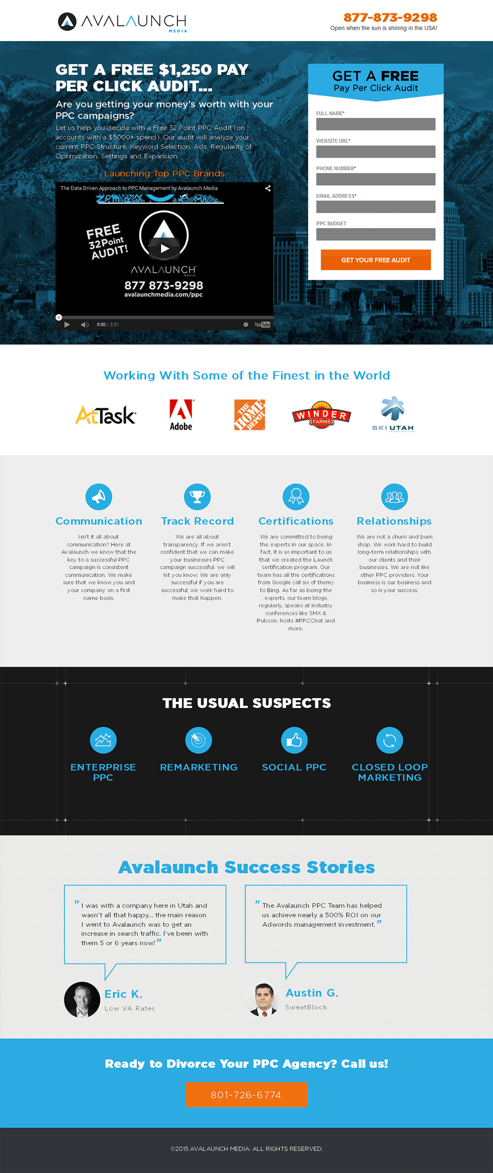
Readability issues
Readability is an important part of clarity, and the headline is cut off in a way that makes it difficult to parse. I’d consider moving the line break from
“GET A FREE $1,250 PAY
PER CLICK AUDIT…”
to
“GET A FREE $1,250
PAY PER CLICK AUDIT…”
Now each line can stand alone and still make sense. The intro paragraph also suffers from readability issues. The type is so skinny that it looks sketchy on top of the background image.
If you have to squint to read, you probably won’t bother.
Looking at the form, I’m not sure what the process will be to get my free audit. Does Avalaunch do the audit and email it to me? Will it be a consultation over the phone? It’s important to establish a sense of expectation so the visitor isn’t left wondering what’s going to happen. I’d suggest placing this information beneath the CTA or, perhaps even better, above the first form field so the expectation is set before visitors start entering (or not entering) their info.
Next up, the subheads. You’re probably noticing a common thread on a lot of these pages: the subheads are completely throwaway and meaningless to the scanning eye. Let’s run through them:
A simple exercise for better copywriting
Write down all of your landing page copy in a document and make sure every single word is congruent (aligned) with your campaign goal. Start with a skeleton outline so you have the main headline and a series of subheads. When the outline tells a coherent story, move on to filling in the story with the details of your campaign.
Testimonials need meat
The first testimonial on this page is really bad. The customer wanted an increase in search traffic. How much did Avalaunch increase it by? What did Avalaunch do to achieve this?
For the second testimonial, how did Avalaunch help its client achieve their goals? The more specific (without giving away your secrets) the better.
Wrapping up
Phewf. That was a lot of ranting. But hopefully with enough juicy fixes and recommendations that are transferable to your own marketing efforts.
For even more juicy tips and tricks, I’d highly recommend downloading my latest ebook, The 23 Principles of Attention Driven Design, where I explain how to combine data and design to create more persuasive landing pages. It will help you to establish a common language with the designers and marketers on your team, which leads to better design decisions and more enjoyable discussions around conversion.

