
Don’t get us wrong: we love good-looking landing pages. The way the colors contrast to draw attention; the striking custom photography and animation; the elegant application of negative space and rule-of-three layouts. Seriously, these things keep us up at night.
But here at Unbounce, we know that there’s more to a landing page than looks. We want the kind of page that won’t embarrass you when you bring it home to your CMO. One that you can really, you know… build a campaign with.
What we really want is landing pages that convert.
Learn all about high-converting landing pages:
- What a high-converting landing page even is
- The average conversion rate for landing pages
- Best practices for building high-converting landing pages
- Examples of high-converting landing pages
What is a high-converting landing page?
In the simplest terms, a high-converting landing page is a landing page that has a higher-than-average conversion rate. It’s got all them elements that get visitors to take action: persuasive copy (with an irresistible value proposition), bangin’ design and structure (with perfectly-chosen images), and a heaping scoop o’ social proof.
Of course, there’s no single formula for creating high-converting landing pages. (Although we’ve got some best practices to help you do it consistently below.) We’ve seen beautiful, compelling pages that just can’t buy a conversion. We’ve also seen landing pages built by a toddler (or look like it, anyway) that convert half their visitors.
There’s also the question of traffic quality. If your page is getting a lot of traffic from poorly-targeted ads, your conversion rate is going to be lower than it would be with more qualified visitors. Keep these things in mind before judging your own pages too harshly.
QUICK TIP
Creating high-converting landing pages is 10x easier with the right tools like:
- A drag-and-drop builder to launch pages fast.
- An A/B testing tool to constantly experiment.
- Analytics to compare conversion rates.
If you’re using Unbounce, you have all three rolled up into one platform. You can build new pages in minutes, launch A/B tests, and measure visits and conversions all in one place. Plus, you can test-drive Unbounce free for 14 days.
What’s the average conversion rate for landing pages?
“Hold on, Unbounce!” you shout at your computer. “You didn’t say what the average landing page conversion rate is!”
Oh, right you are. We’re getting ahead of ourselves.
The average conversion rate for a landing page is 6.6%. That means only about 1 in 20 people who reach your landing page will complete your call to action—buy your product, download your ebook, trial your software.
But there are lots of variables. Lead generation landing pages (where visitors need to fill out a contact form) typically have lower conversion rates, whereas click-through landing pages often perform better because the conversion goal is much simpler.
Conversion rates also vary between industries. For example, ecommerce landing pages have an average conversion rate of 4.2%. Travel and hospitality landing pages convert at 4.8%. Entertainment landing pages have a whopping 12.3% average conversion rate.
The point? A great conversion rate for you will be different than the rate for your marketing peers, or that store down the street, or your dog. Check out the Conversion Benchmark Report to find out what “high-converting” means for your campaigns. (And learn some data-backed optimizations while you’re at it.)
How do you build landing pages that convert?
(“Yeah, yeah, take me to the high-converting landing page examples!”)
People have created a lot of landing pages with Unbounce (like, so many, you guys)—so we think we’ve got a pretty good understanding of what makes a page convert. Over the years, it’s become clear that nearly all successful landing pages have some key elements in common. (And you better believe our landing page templates were built with these principles in mind.)
High-converting landing pages:
- Have a strong, contextual hero shot and supporting imagery
Your hero shot (the primary image or video on your landing page above the fold) is the first thing visitors are going to focus on, so you’d better make it captivating. Show your product or service in the context of use: demonstrate how it works and make it easy for people to visualize themselves enjoying the benefits. - Present a single and focused call to action
Your call to action (CTA) is the one thing you want visitors to do on your page and your primary conversion metric. Make sure your CTA is obvious (from a design perspective) and compelling (from a copy perspective). Best practice is generally to remove any secondary links that might cause someone to leave your page before converting through your CTA, including site navigation. - Clearly state your value proposition with a compelling header and subhead
Why should visitors accept your call to action? Use your headline and subheadline to articulate your value proposition, clearly stating the benefits of your offer, why your target audience should care, and what makes you different from your competitors. - Outline the features and benefits (with emphasis on the latter)
Sure, people need to know what your product or service does, but they’re much more likely to convert if they understand the benefits they’ll receive by following through with your CTA. Benefits-oriented messaging (as we’ll see in some examples) is one of the best ways to drive conversions. - Include testimonials and other forms of social proof
People are much more likely to convert on your landing page if they believe that others have done it before them and have been happy with the results. Social proof—testimonials, reviews, partner logos—can be a fast and effective way to build credibility with your prospects. (What’s the difference between a prospect and a lead, anyway?)
15 of the best high-converting landing page examples
Before we dive into our high-converting landing pages examples, let’s set some ground rules. All of the pages featured below have had at least 500 visitors on the low end, though many have had more than 100,000. They’re also all converting at a rate of at least 30%.
With that out of the way, here are 15 high-converting landing page examples from Unbounce customers (with conversion tips from the people who actually built ’em).
1. Promo
Industry: Social Media / Conversion Rate: 46.94%
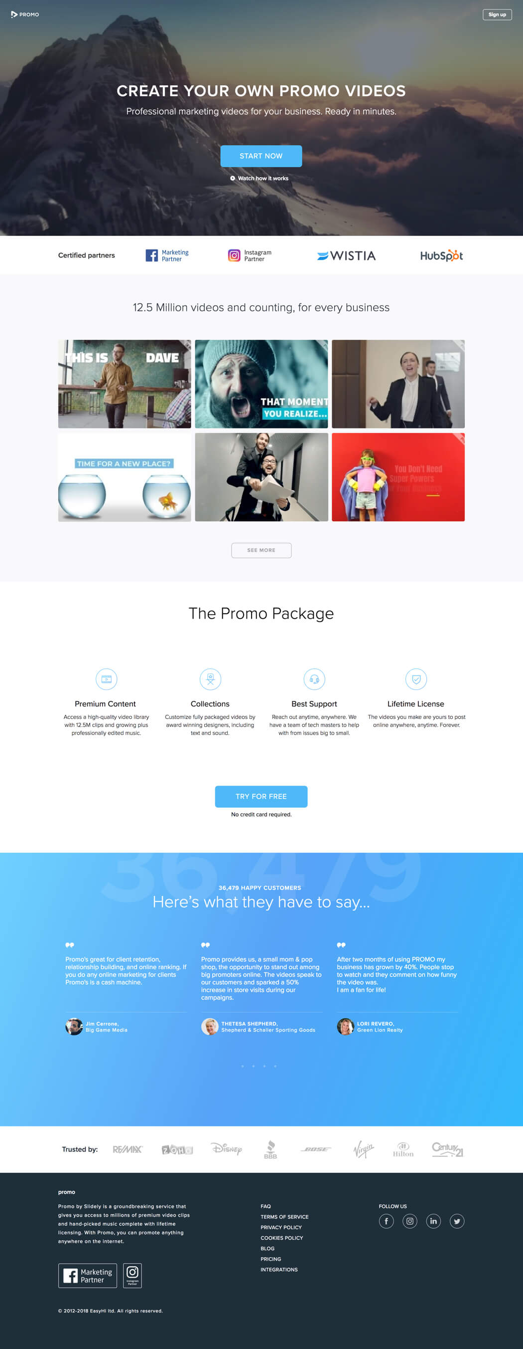
Promo’s high-converting hint: Use video to increase visitor engagement and drive conversions.
If we’ve said it once, we’ve said it at least several more times: using video on your landing page is a great way to boost engagement and crank up your conversion rate. In fact, including some moving pictures on your page can increase conversions by as much as 80%. A worthwhile investment, no?
Promo thought so, too, which is why they included a ton of video content on this landing page for their video creation service—from the header, to the explainer video, to the sample videos that visitors can actually use in their own marketing.
Noted Yael Miriam Klass, Content Lead at Promo:

We specialize in creating converting videos that attract viewers and elicit action.
To that end, our landing page has a beautiful and dynamic header video taking up the first fold, overlaid with text that shows a clear value proposition.
Still, video is just part of the equation. You want visitors to convert, and that means getting them to follow through with your call to action. Don’t worry—Yael’s on it: “No landing page can make an impact without direct text and an eye-popping CTA button on the first fold.” Promo nailed those elements, then topped it all off with a swack of testimonials and strong client logos. Great job.
QUICK TIP
Landing pages with video can increase conversions by 80%. If you’re building your pages with Unbounce, you can easily add video elements or use a video background in the builder.
A few video ideas to get you started:
- Recorded product demo to show key features (30-120 sec)
- Quick explainer animation solving a pain point (60 sec)
- Customer success story with real results (30-60 sec)
- Behind-the-scenes look at your process (30-45 sec)
- Problem-solution hook to grab attention (45 sec)
2. edX
Industry: Education / Conversion Rate: 52.68%
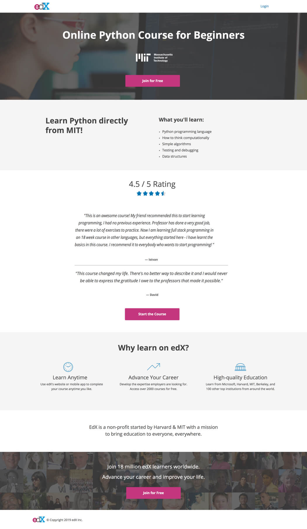
edX’s high-converting hint: Simplify your pitch and make the benefits crystal clear.
Us marketers tend to be so close to our products and services that we can sometimes overload prospects with too much information. “Yes, our core offering is X, but how ’bout these bells? What about them whistles?” No, they probably didn’t know about those extra benefits—but at this stage, they probably didn’t need to.
On the landing pages for their online courses, edX’s Senior Growth Marketer Josh Grossman chose to pare the message down to just the main points he wanted to visitors to take away. “Rather than get bogged down in the details of the course, we made it easy for people to understand what they’ll learn using just a few bullet points.” That, and an unambiguous head and subhead followed by solid social proof.
“In our testing, shorter copy worked better than longer copy,” Josh added. “Either you want to learn Python, or you don’t.”
That’s an insight we should all take to heart. Some people aren’t going to want what you’ve got, no matter how much extra information you throw at them. Better to save your breath (or word count) and focus on the people who do.
3. Simply Business
Industry: Insurance / Conversion Rate: 62.26%
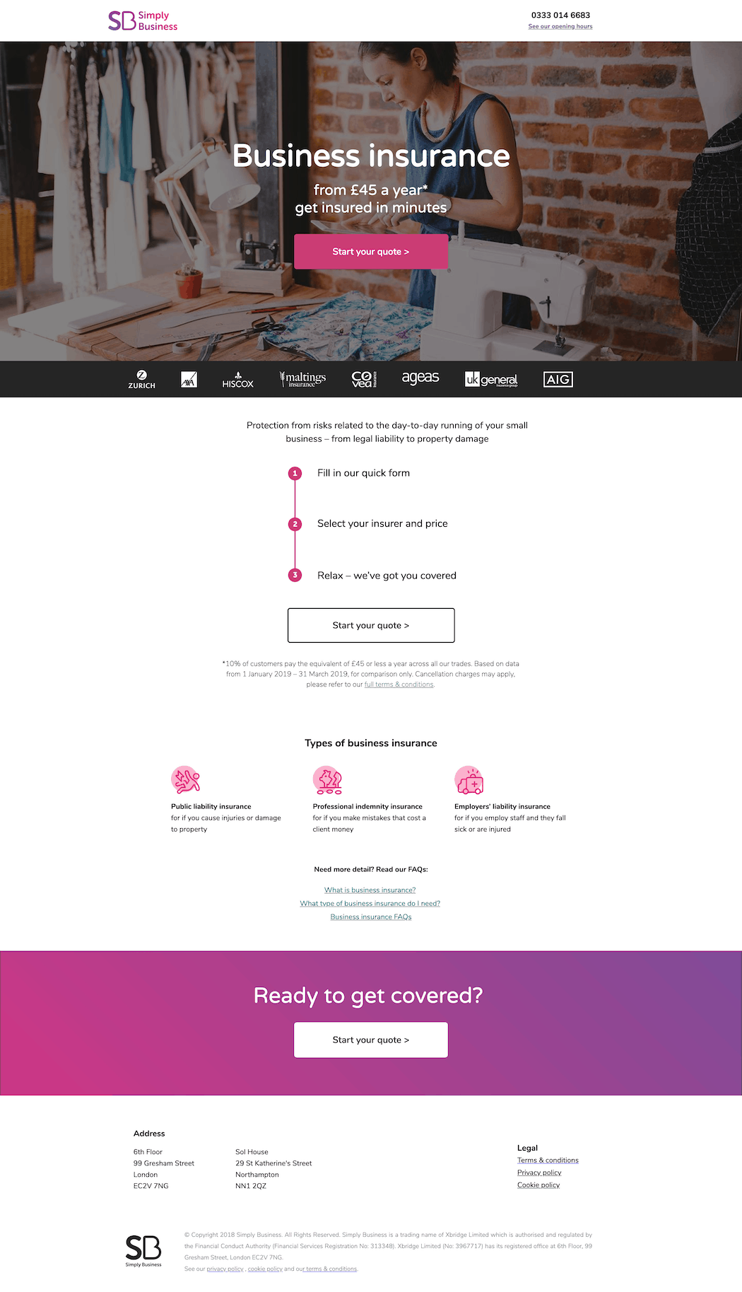
Simply Business’s high-converting hint: Present complicated products in an uncomplicated way.
Insurance has always been a complex product. Between liabilities, deductibles, prohibited risks, and loads of other terms we had to Google, just signing up can feel like a crash course in law. And by the time you’re covered, you still might not understand what being covered even really means.
Simply Business wants to change that, and it lives up to its name with this landing page that makes business insurance feel, well, simple.
Rather than risk overwhelming visitors with a ton of information about their policies, Simply Business keeps things light. The headline immediately soothes some of the most common concerns about insurance—that it’s complicated, that it’s expensive—and the bulleted how-to instructions make signup feel like a breeze.
It’s only after visitors click through the call to action that Simply Business introduces some friction in a multi-step form—but by then, visitors have already overcome that first mental hurdle and are much more likely to see it through.
4. Later
Industry: Social Media / Conversion Rate: 57.92%
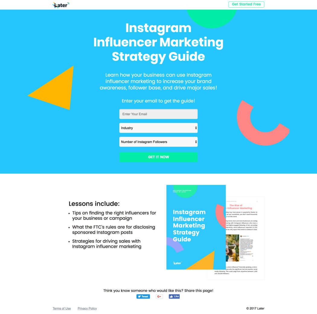
Later’s high-converting hint: Maintain conversion scent and balance your incentives.
Humans are fickle creatures. They’re easily distracted. They get confused. Mostly, they’re bad. As a marketer, that means you often need to hold their hands—or, for our purposes, hold their noses—through each step of the purchase process.
Conversion scent is the principle of keeping written and visual cues consistent all through the consumer journey. That’s what Later did for this lead generation campaign, as Chin Tan, the company’s Communication Design Lead, explains:

We maintained conversion scent throughout the campaign. The offer matches what’s in the ad, in the email, in the creative before the landing page, and after the page as well.
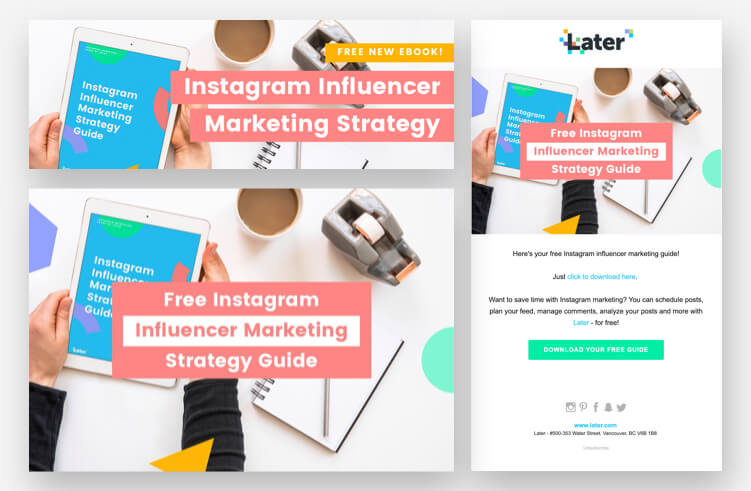
Chin also acknowledges that the simplicity of the offer contributed to the page’s success. “It’s clear right away what you’re getting: you’re exchanging your email for access to the guide. The form isn’t too long and only requests pertinent information.” Asking for too many personal details at this top stage of the funnel can spook visitors. Make sure your ask matches the value of the incentive you’re offering.
5. The Listings Lab
Industry: Real Estate

The Listings Lab’s high-converting hint: Use straightforward design and focus on the offer.
Another lead generation page, our example from The Listings Lab isn’t the flashiest on the list, but don’t let that fool you: this simple page packs a punch.
First, let’s talk design. The Listings Lab has done a great job of condensing all of the page content into a small space without making anything feel crowded. Visitors don’t need to scroll to understand what’s on offer and why it’s valuable.
“A mock-up of the download helps people feel that it’s a well-produced, real thing that they can read,” offered Yves Lenouvel, Marketing Director at The Listings Lab. “Bold text on the form’s big, colorful button draws people’s attention to the CTA.” Not to mention the directional cue, which is another nice touch.
Still, it’s the benefits-oriented copy that puts this page over the top. The Listings Lab really zeroes in on key pain points for realtors—cold calling, poor leads, long hours—and offers an alternative. “The first piece of copy people see is speaking to the visitors’ pain and then presenting them with a solution.” Read the guide, make more money, get your life back. What’s not to like?
Bonus points for a privacy statement that instills confidence while keepin’ it casual.
6. Twillory
Industry: Clothing / Conversion Rate: 46.85%
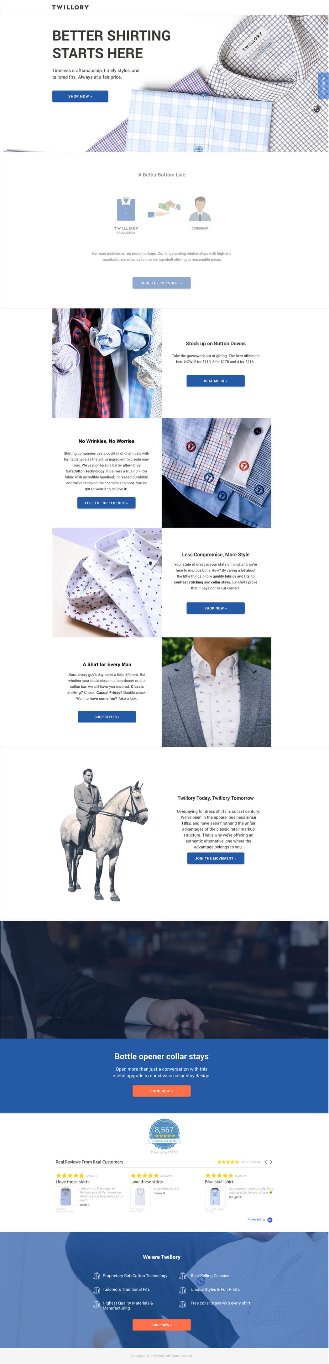
Twillory’s high-converting hint: Build custom experiences for your mobile visitors.
We don’t need to tell you that mobile consumers should be a priority. (Although we have been telling you for, like, ever.) By 2017, mobile had become the dominant source of web traffic worldwide at 50.3%—a segment that expanded last year, reaching 52.2%. It’s no longer enough to think of mobile consumers as part of your online audience. In 2019, they’re often the majority. (Check those GA reports, people.)
Aditya Bagri, Digital Automation Manager at WITHIN, described how his outfit is adjusting to a world in which consumers’ first experience with a brand is often on their phones:

Our landing page creation strategy is mobile-first, and optimizing for mobile helps us get first-time viewers down the funnel.
Better than merely building mobile-responsive pages, many brands are creating separate experiences for their mobile visitors.

Enter WITHIN and Twillory. On desktop, this landing page includes videos and GIFs—elements that have been shown to increase visitor engagement and help drive conversions. On mobile, though, we get a stripped-down version that maintains the visual appeal of its big brother while also ensuring lightning-fast load times on cellular connections.
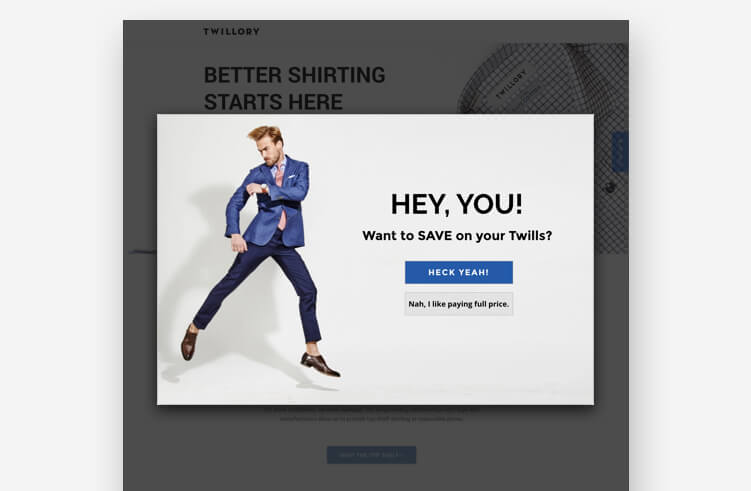
And Twillory gets an extra nod for using an Unbounce popup to give visitors additional conversion incentives.
QUICK TIP
The 2024 Conversion Benchmark Report found that 83% of all landing page visits happen on mobile devices.
If you’re using Unbounce, you can do most of the mobile optimization heavy lifting with the click of a button. Just double-check that everything’s formatted as it should be and you’re set.
7. TyresOnTheDrive
Industry: Automotive
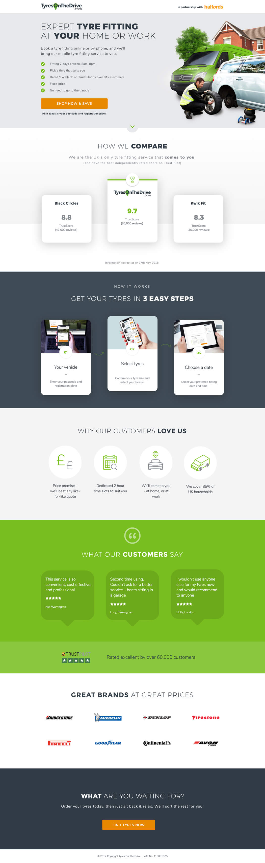
TyresOnTheDrive’s high-converting hint: Be clear in your headline and then back it up with social proof.
When it comes to landing page copy, clarity leads to conversions. Your visitors should know within seconds exactly what you’re offering and why they need to care. If they don’t, they’re likely to bounce.
This page from TyresOnTheDrive illustrates the importance of clarity with a headline that immediately conveys the value proposition: “Expert Tyre Fitting At Your Home or Work.” Right away, we know the differentiator is that we don’t have to go to a mechanic—they’re coming to us. Coupled with a quick how-to, a load of testimonials, and a big-brand logo collage, we have enough information about TyresOnTheDrive to make a purchase decision in a very short period of time.
The result? Conversions through the roof.
But great conversion rates aren’t an excuse to stop testing. Chris Wood, TyresOnTheDrive’s Senior UX Designer, described how the company has played with other pitch angles yet keeps coming back to the fundamentals. “We’re finding that more benefit-oriented messaging seems to convert better than pushing offers and promotions.”
8. ooba
Industry: Finance / Conversion Rate: 35.57%

ooba’s high-converting hint: Use a descriptive call to action that tells visitors what’ll happen next.
Yes, it’s important that your visitors know what you’re offering the moment they hit your page. But just as essential is that visitors know what you want them to do—and what will happen when they do it.
This page for ooba (designed by digital agency Signpost) provides a great example of an effective call to action. At a glance, the copy—along with the contextual cues and supporting information—tells us what we can expect when we fill out the form.
“The form is positioned at the top of the page, above the fold, which makes the action we want the user to take clear from the outset,” said Adam Lange, CEO at Signpost. “The contrasting color draws the user’s attention to the end goal, and the descriptive button confirms the action they’re about to take.”
The form asks for a lot of information, but that might actually help build credibility in this context—we’re trying to get a home loan, not sign up for a newsletter. It makes sense that we’d need to provide some details if we’re expecting to be pre-qualified.
9. ClaimCompass
Industry: Legal / Conversion Rate: 30.02%
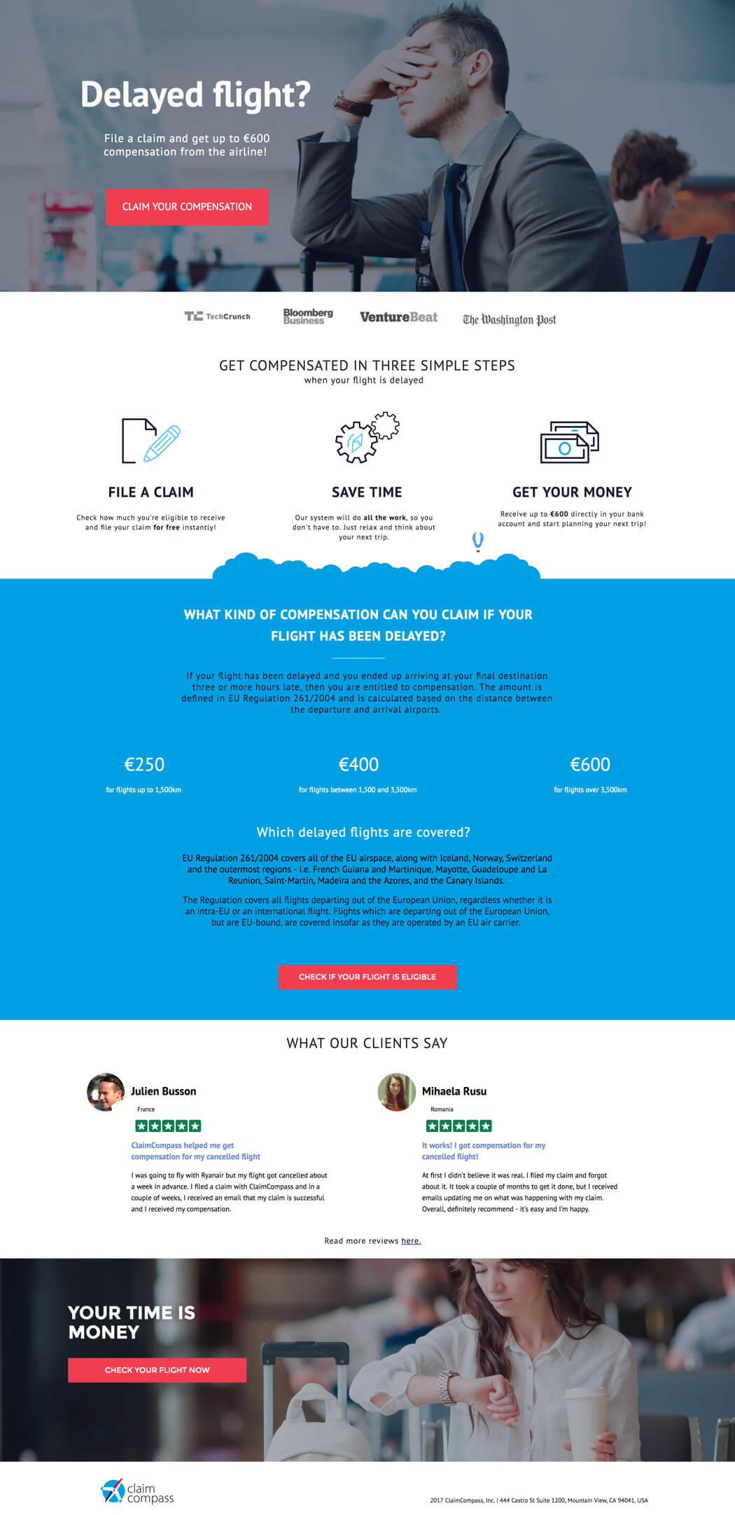
ClaimCompass’s high-converting hint: Ensure visitors have enough information to convert (and then ask them again).
What’s that old saying? “If at first they don’t convert, try, try again”? (It’s not. Please don’t say that to people.)
However, that’s precisely what ClaimCompass did for this landing page targeting travelers who’d been on delayed flights to, from, and within the European Union, where legislation mandates that airlines pay compensation for significant travel disruptions.
Alexander Sumin, the company’s Co-Founder and CMO, described the surprisingly difficult task of getting people to collect their no-strings cash.

We tried to provide some valuable information and back it with authority—not only the social proof and media logos, but briefly explaining how it all works.
That adds more credibility to the offer, which is important when you’re promising free money.
ClaimCompass recognized that they’d be talking to customers with varying degrees of EU regulatory expertise. (Any GDPR-heads out there?) As such, they knew some people would have enough information to convert right away while others would need some educating.
“The entire landing page is designed to make people click on one of the three CTA buttons,” Alex explained. “If the offer is appealing, they don’t need to scroll further. If it isn’t, the sections below provide more clarity on the process, with images, benefits, and social proof. Each scroll is supposed to get the users closer to clicking the CTA.”
Looking specifically for ecommerce landing page best practices? With examples from 27 big-time online retailers, the pages featured in our Ultimate Ecommerce Landing Page Lookbook hold an average conversion rate of 27.29%.
10. Extreme Lounging
Industry: Furniture

Extreme Lounging’s high-converting hint: Run giveaway campaigns to drive leads like crazy.
Extreme Lounging might have the simplest landing page in this list from a copy and design perspective—but, boy, it sure is effective.
The whole page amounts to a hero image, headline, and email form, prompting visitors to register for a chance to win a limited edition chair. There are no listed benefits, no competitive differentiators. (Presumably Extreme Lounging has done some of that legwork before people hit this page.) Here, it’s all about building leads. You want this chair? Cool, give us your email. No reason to make things complicated.
Some marketers will object to the basic style, but it’s hard to argue with Extreme Lounging’s results. They’ve been running a new contest (with a new landing page) each month for over half a year, and although they prefer to keep the exact number under wraps, suffice to say that their conversion rate would make you blush.
It just goes to show: no matter how good you look or sweet you talk, nothing motivates people quite like free.
11. onX
Industry: Navigation / Conversion Rate: 61.15%
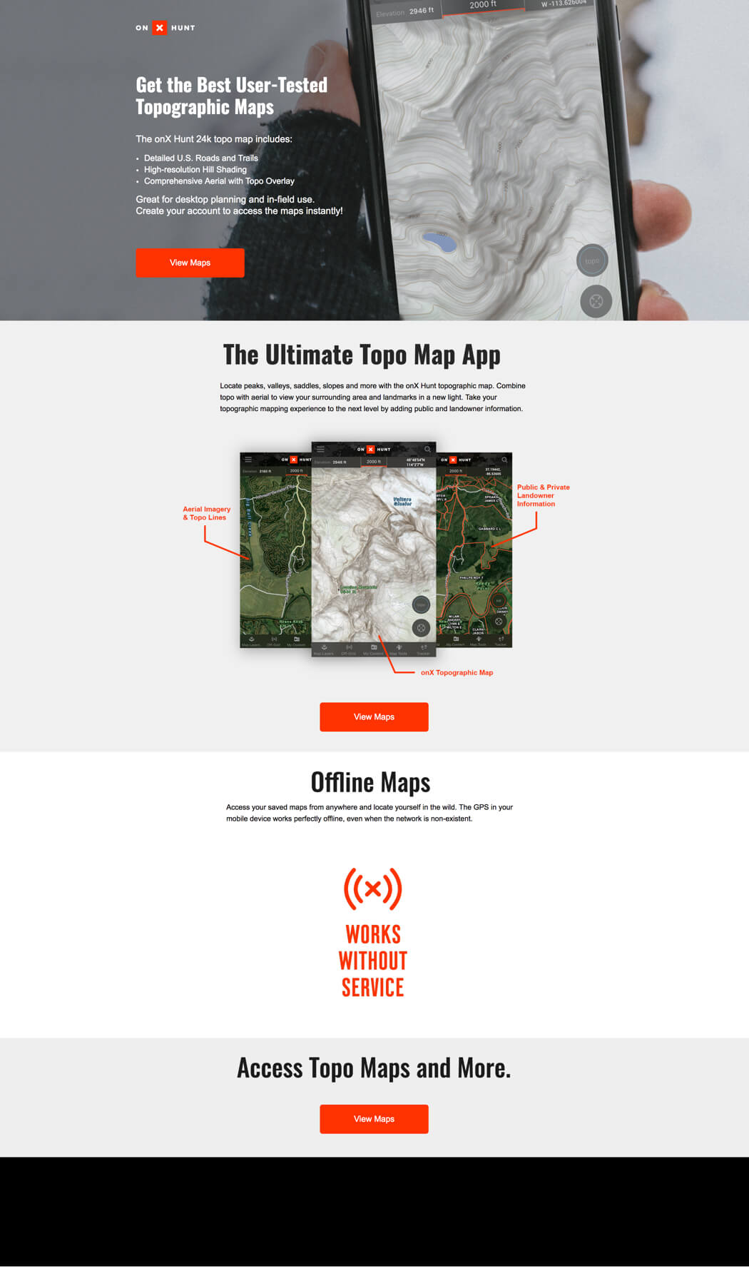
onX’s high-converting hint: Match visitor search intent in written and visual content.
Something we at Unbounce have really hammered home over the years is the importance of message match. When someone clicks a Google ad for, say, topographic hunting maps, they expect to land on a page with copy that aligns with their original search intent. Even better? A page that immediately demonstrates the searcher is in the right place through the accompanying imagery.
For a great example, look no further than this page from onX, which (at the time of writing) sports a conversion rate over 50% higher than the average. We asked Ryan Watson, User Acquisition Manager at onX, why he thought the landing page has been so successful:

The landing page creative showed the user exactly what they were looking for from a PPC Google Ads search click.
Correlating the search with an exact visual cue is a must with product feature landing pages and search strategy.
Ryan also credits A/B testing for onX’s high-converting landing page. “We tested many different CTAs, and we found one that worked and got a massive click-through rate.” Hey, landing page best practices never hurt, either.
 [Updated for 2021]")
12. Investing Shortcuts
Industry: Finance / Conversion Rate: 51.32%
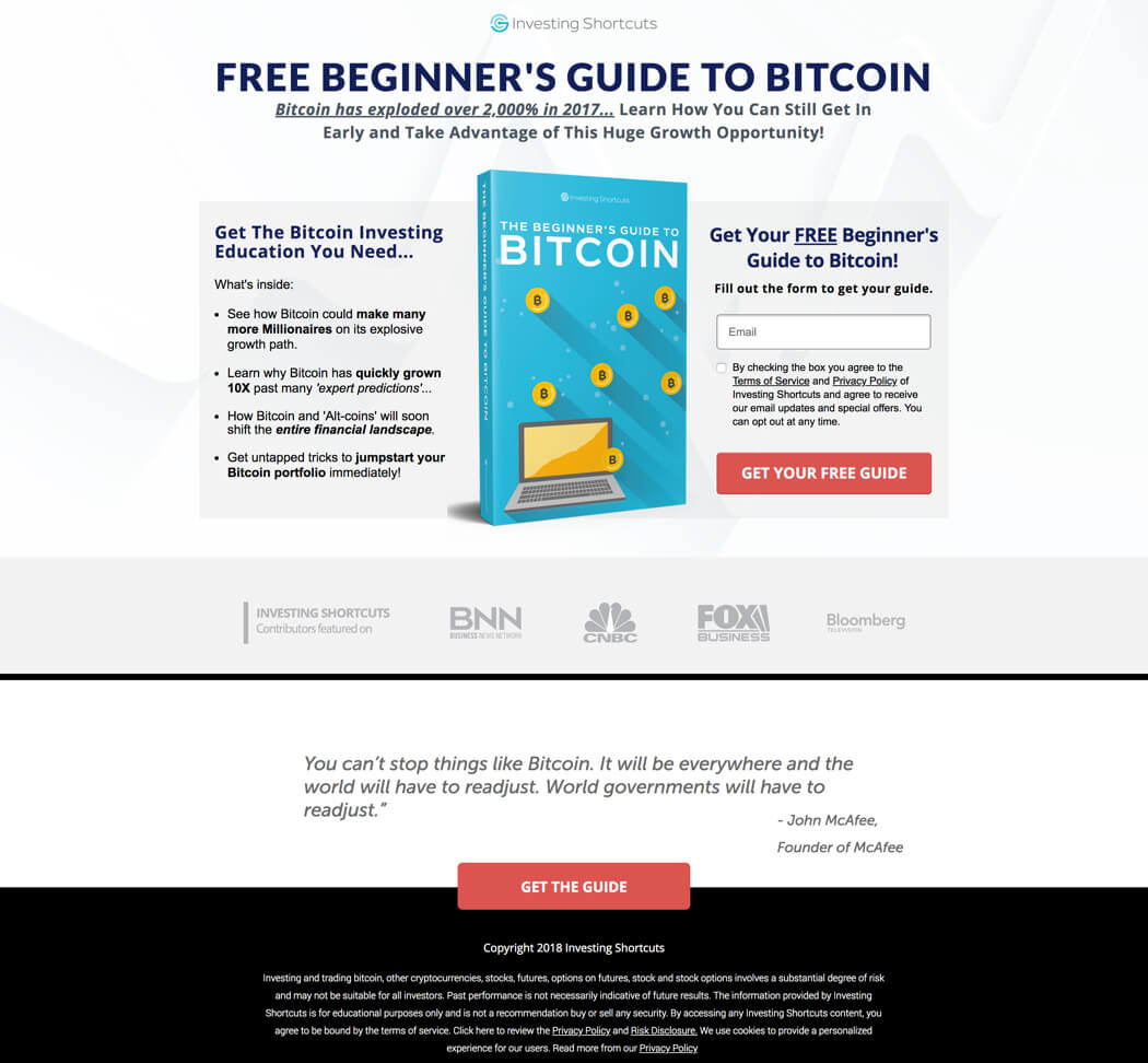
Investing Shortcuts’s high-converting hint: Create urgency in your offer whenever possible.
Fear of missing out (FOMO) is one of the most powerful tools in every marketer’s arsenal. People hate it when their peers are having fun, being cool, or making money without them. It’s petty and vindictive, sure, but it’s also innately human. (Man, we’re picking on our species today.)
This landing page for Investing Shortcuts (built by Strikepoint Media) harnesses FOMO to push conversions into overdrive. The copy highlights the meteoric rise of Bitcoin’s value and urges visitors to get in while the gettin’s still good. “This page had the most success when Bitcoin was hot, so it was the right offer and the right time,” explained Jeremy Blossom, Co-Founder and CEO of Strikepoint. Anyone out there still HODLing?
Bitcoin’s popularity aside, a lot of what makes this a high-converting page comes down to good fundamentals. “While it isn’t the prettiest page, the copy connects with readers and builds on their interest in the subject matter while clearly communicating the value of the guide,” Jeremy noted. “The page also uses the ‘featured on’ logos and a high-profile quote for social proof.”
13. MyTutor
Industry: Education / Conversion Rate: 55.29%
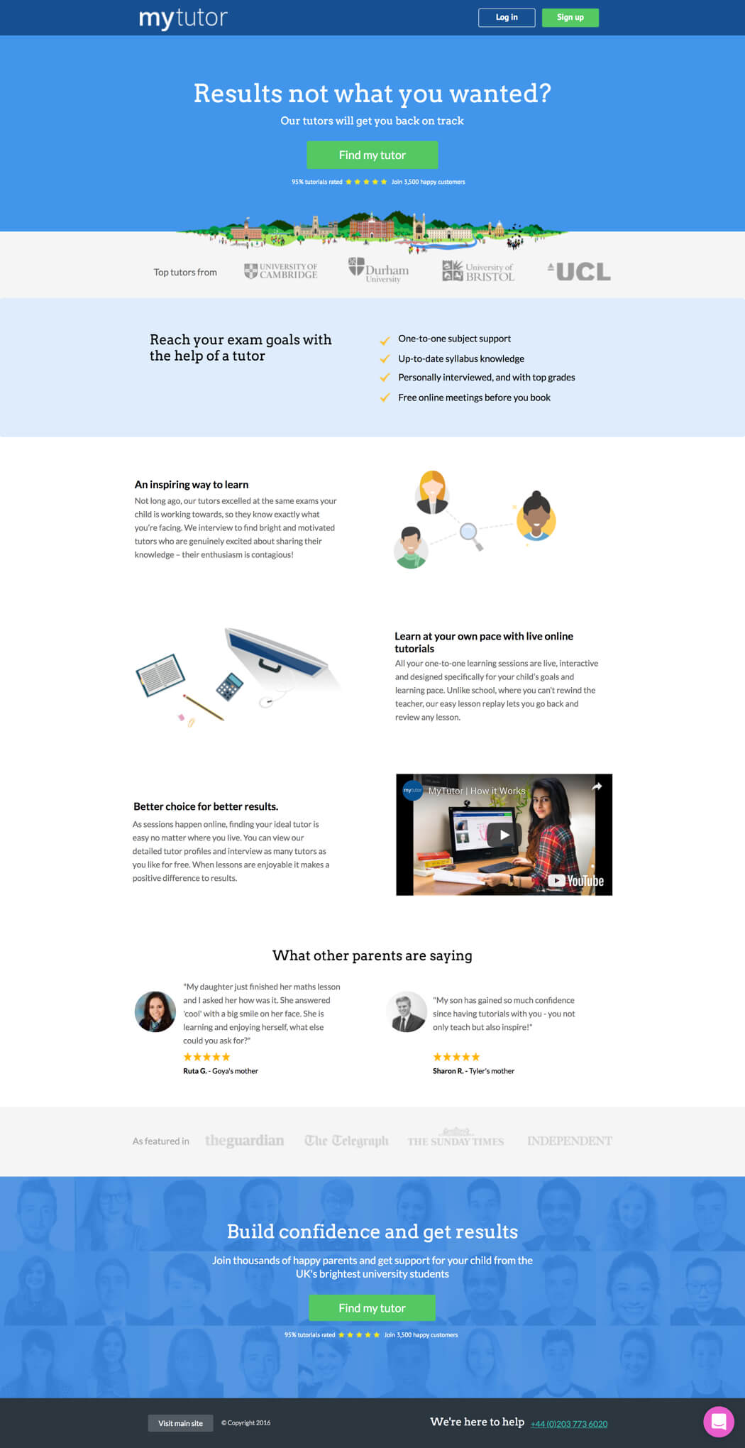
MyTutor’s high-converting hint: Present the right offer to the right people at the right time.
So much of a campaign’s success comes down to effective targeting. It’s not just about reaching your target demographic—it’s also about presenting them with highly-targeted offers that make sense in the context of their experience at that particular moment.
Our previous example from Investing Shortcuts demonstrates how an offer can be well-timed for a major cultural event (like the crypto-frenzy of late 2017). This landing page from MyTutor, though, goes one step further. It shows how marketers can connect with their audience at a significant (and even deeply personal) moment in their individual lives, during which the offer is especially meaningful.
Gemma Pearson, Digital Marketing Manager at MyTutor, explains: “This landing page was a fundamental part of our exam results day campaign. It was designed to encourage students who hadn’t achieved the grades they needed to get back on track with a tutor to support their needs.”
Most of us have done poorly on a test, and (I’m comfortable speaking for all of us here) it sucks. The last thing Gemma wanted to do with this page is appear to be scolding or lecturing students that might need a little help.

The relevant, positive messaging—along with timing and a clear CTA—were key factors in this landing page’s success.
It provided messaging that both empathized with their situation and offered a clear solution to get the results they needed.
Now that’s how you make a pitch that resonates.
14. College Board
Industry: Education / Conversion Rate: 77.38%
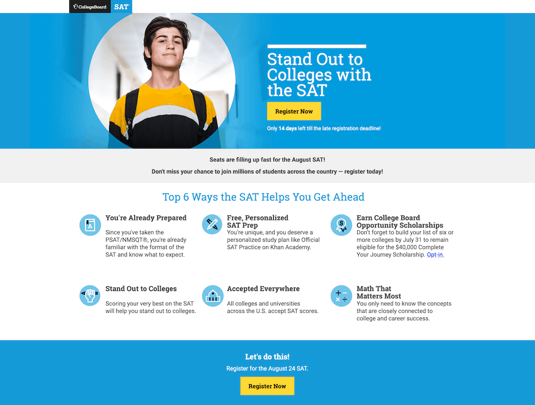
College Board’s high-converting hint: Set an expiry date on your call to action.
Like the past couple of landing pages, this one from College Board—a nonprofit aimed at expanding access to higher education—is all about using time to motivate conversions.
The goal here is getting would-be college applicants (who’ve already taken the PSAT/NMSQT) to register for an upcoming SAT and improve their chances of being accepted at the school of their choice. That oughta be incentive enough, but sometimes (and I’m drawing heavily on my own meandering academic experience) students need a kick in the pants. And if there’s one thing they understand, it’s deadlines.
College Board makes it super clear how long students still have to sign up for the next SAT by including a countdown just below the top CTA and a hard cutoff date alongside the bottom. Coupled with copy that’s one part urgency (“Seats are filling up fast!”) and another part encouragement (“You’re already prepared!”), this landing page successfully urges students to take the next step in their academic careers.
15. FilterEasy
Industry: Home Repair / Conversion Rate: 34.52%
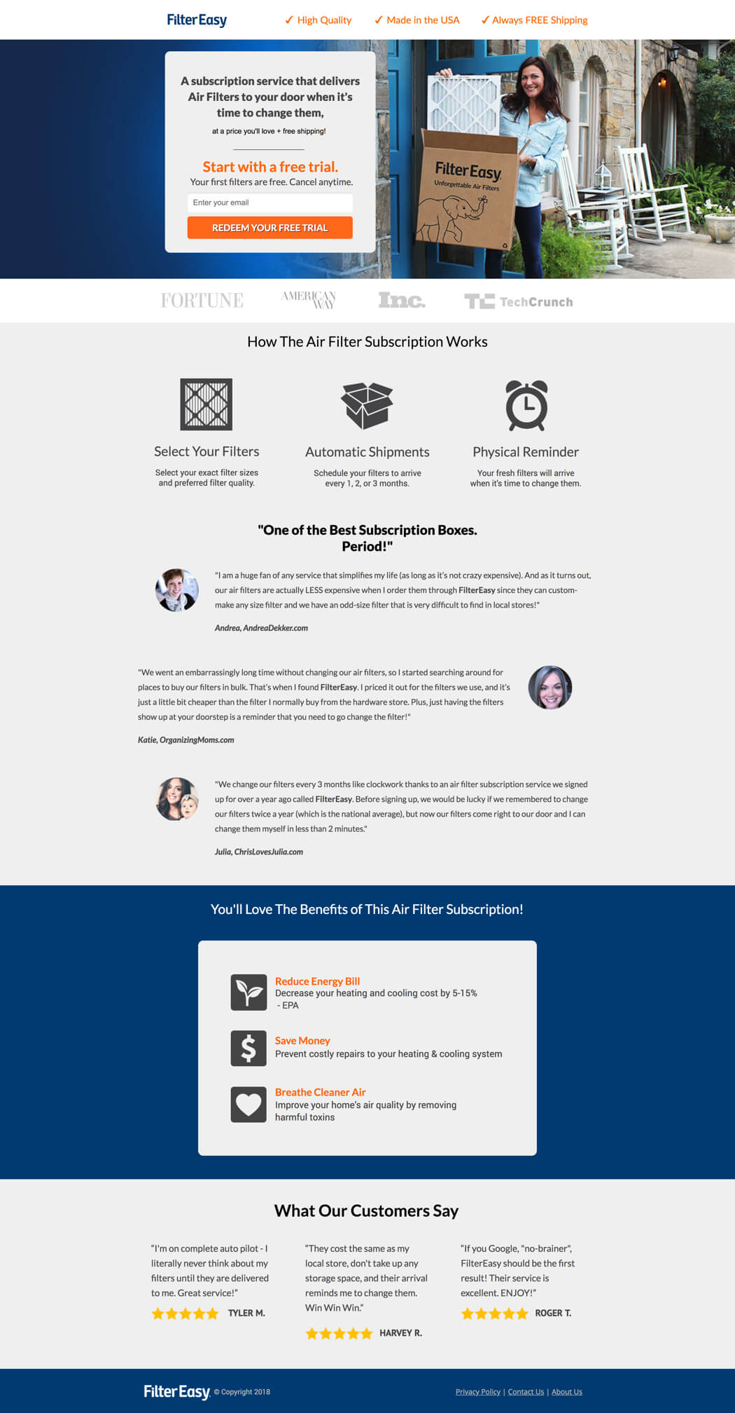
FilterEasy’s high-converting hint: It’s not always clear why a landing page is successful—and that’s okay, too.
Every so often, you’ll build a landing page that strikes conversion gold. It’s got a higher form-fill rate than you’ve ever seen. It’s driving revenue like crazy. It’s cutting down challengers like Russell Crowe in that movie about gladiators. (What was it called?)
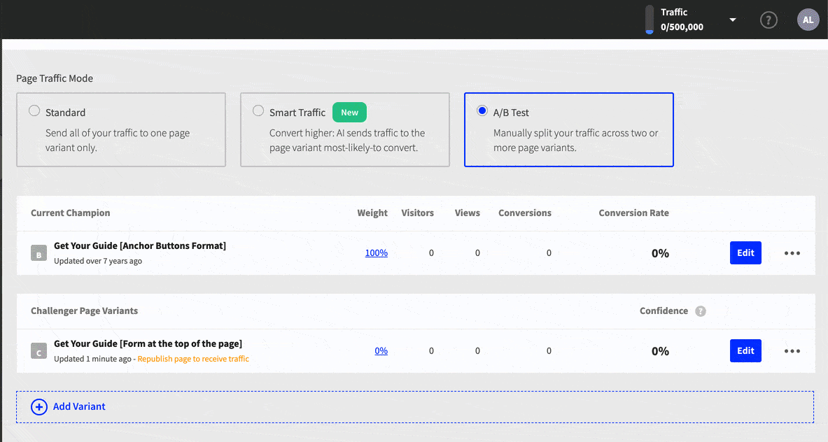
That’s what happened to Rianna Riddle, Growth Marketing Director at FilterEasy. She built a killer page, then found herself grappling with a question we’ve often asked ourselves: what exactly is making this page successful?
“Honestly, we’re still constantly testing to figure out what’s so great about this landing page,” Ri explained. “We’ve challenged it several times, and none of the challengers have beat this champion page—even the ones we were absolutely convinced would beat it.”
The reality is that building high-converting landing pages isn’t an exact science. Sure, there are best practices that can improve your page’s chances of success, and Ri employs them here: straightforward landing page structure & design, strong benefits statements, great social proof, compelling offer. Ultimately, though, the only way we can be confident that we’ve achieved our best page is by continuing to test.

